Histograms and S-Curves
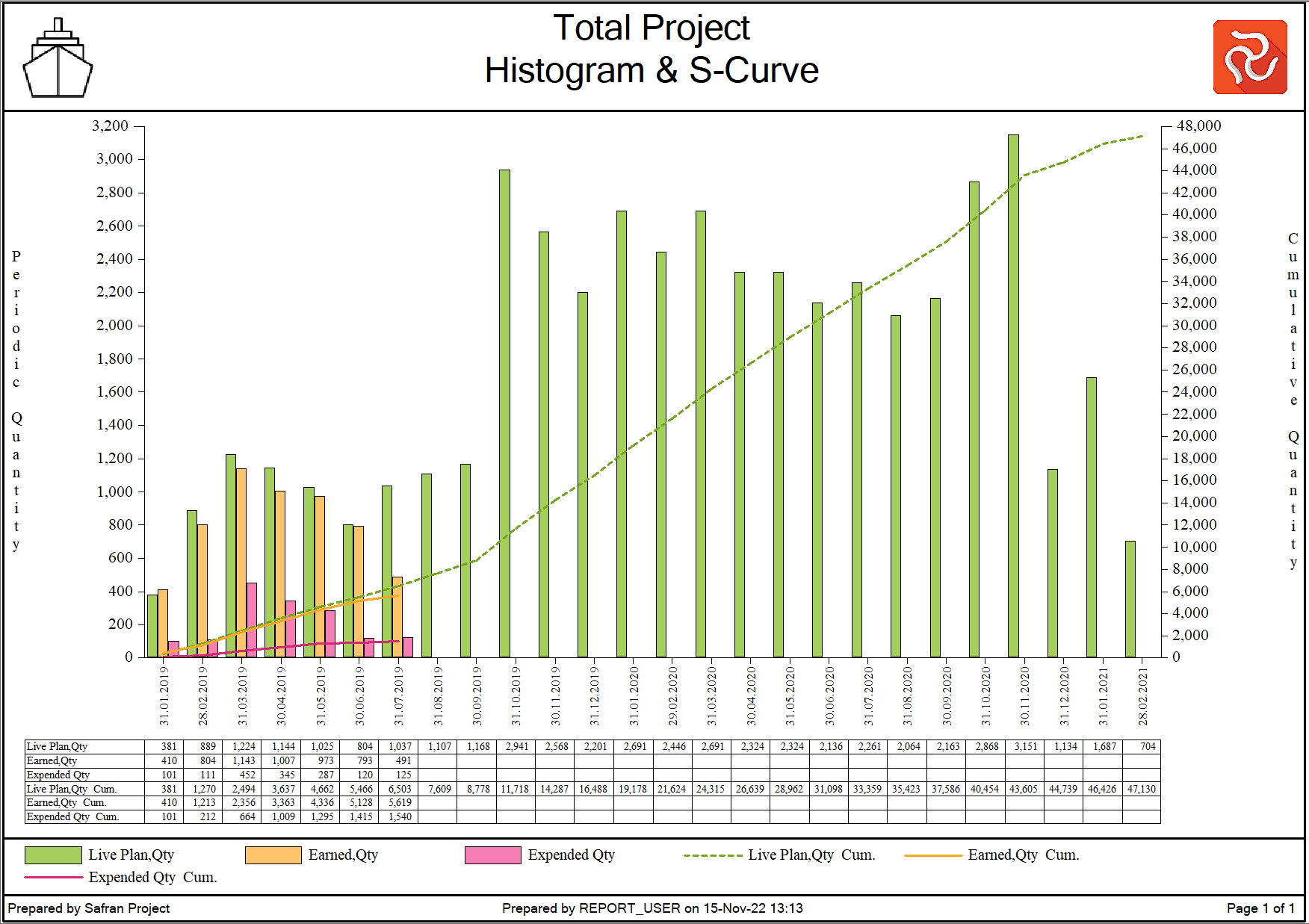
The S-Curve is a well-known project management tool consisting of "a display of cumulative costs, labor hours, or other quantities plotted against time.” The name derives from the S-like shape of the curve, which is flatter at the beginning and steeper in the middle, and this is how most projects look. The S-curve is used to visualize the original schedule, baseline, earned value, expended, forecast, etc. That is why there are a variety of S-Curves.
In addition to the traditional S-Curve, Safran Project also lets you produce Burn-Down Charts. A burn-down chart is a graphical representation of work left to do over time. You could say that the burn-down chart is the opposite of the traditional S-Curve.
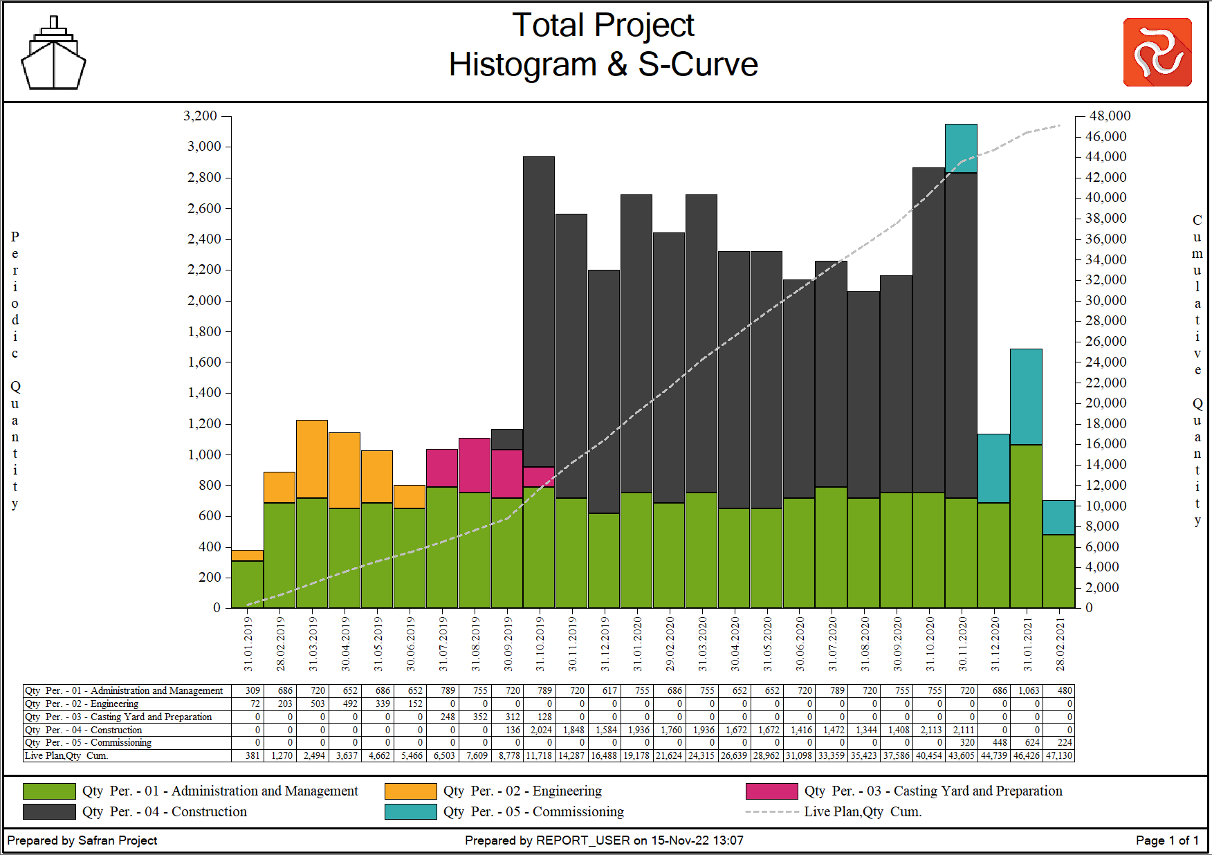
The Histogram illustrates sets of periodic data for a continuous time scale in a way that is easy to understand, as it is simple to read. The histogram can show cost, labor hours or quantities, resource utilization, etc. Histograms can be used to conduct comparative figures such as:
- Planned vs. Actual
- Planned vs. Earned
- Planned vs. actual and earned
- Resources planned vs. available and optionally with cumulative over/understaffing
Using Safran Project, generating S-curves combined with Histograms and table graphs is easy. There are software-scheduling packages that do not offer this valuable tool, and third-party software applications and extra programming and development are needed to generate the required S-curves.
Safran Project provides two Histogram and S-curve generators for reporting purposes: The Histogram/S-curve report and the Histogram of the Barchart Editor. A third tool—the Resource histogram of the Barchart Editor—may also show resources or costs.
The following sections explain the features of the Histogram/S-Curve report and how to customize it to show the curves and histograms needed. Please see the Barchart Editor section for details on the formatting capabilities of the histograms provided with this tool. It would be best to study the Common Report Features section for more information on features standard to the Safran Project reports, such as page setup, filter, preview, and more.
 {height="" width=""}
The Histogram / S-Curve Report
The Histogram / S-curve reports have a lot of options to configure and customize your report to produce the reports needed: define an axis, select single or multiple S- Curves and specify their entries and budgets, periodic bars on quantities or manpower, stacked elements or clustered, customized table entries, cost or quantity based report, and more.
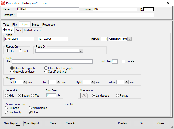
The configuration pane is a tab-separated pane with five tabs. The Titles and Filter tabs are discussed in previous chapters. Use the Report tab to specify the time axis (X-axis) span and interval, to report cost or quantity, set the margins, page orientation, and legend position, optionally include background graphics, specify left and right axes, and add vertical and horizontal grids and curtains.
You can select entries for periodic bars, cumulative lines, S-curves, Burn-Down curves, Cumulative over/understaffing curves, and table data using the Entries tab. A new bar or line entry adds a new table entry by default. However, if you wish, this can be removed from the table, and new entries may be added. The table entries do not have to be the ones presented as lines or bars.
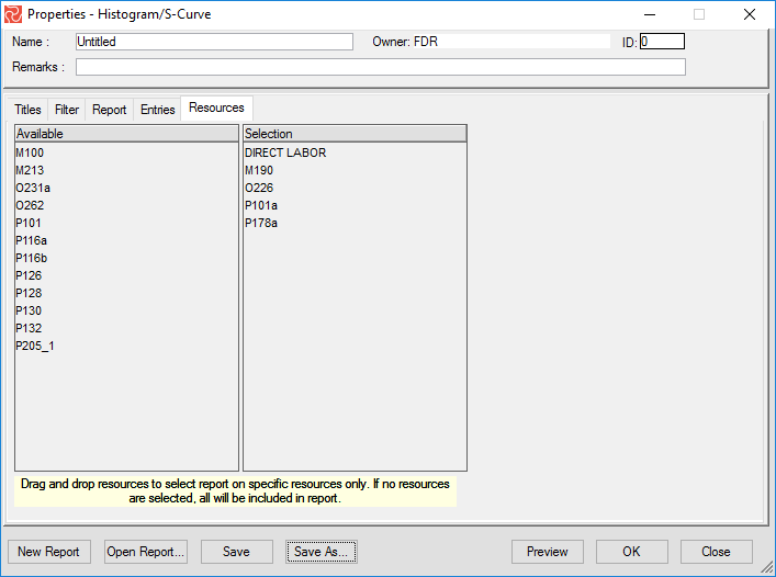
The Resources tab allows you to select specific resources to be included in the report. The default is ‘All Resources’. The resources tab enables you to add a resource filter to the filters added or included using the Filters tab. For example, you may add a filter to show only activities for Project Phase = K and then select to include only the Resource type = BMHRS.
Choose Reports > Histogram/S-Curve to select a customized Histogram/S-Curve report or to start specifying your own report.
Setting Page Options
When specifying your report, consider the X-axis span: should the report cover the entire project, and if so, what is the appropriate X-axis or time-axis interval? If you want to present a more detailed view of parts of the project, you may specify a narrower period together with an interval of days or weeks. Other options to consider are:
- Should your data presented be cost or quantities?
- How should the table data be presented?
- Should it be a summarized one-page report, or do you want a page for each project phase, discipline, or other code? Should the page value be displayed using the shortcode or description?
- What page orientation is best suited?
- Should it include background graphics to allow my graph to overlay? For example, a picture of my building site, and when I update progress next month, I could add a new image showing how it progresses on site.
- Should I include vertical date lines and shaded curtains on my report?
- Should I include horizontal value lines or shading?
- How should I specify the right and left axes?
- Should I present data as percentages or as quantities?
Safran Project provides you with many options. To guide you, the reports tab is a tab-divided pane with a General tab, an Axes tab, and a Grid/Curtains tab.
Specify Report Span and X-axis Interval
Use the General tab to specify your report span X-axis interval and unit. The dates in the Span text box control the length of the "time window" displayed in the graphic area. The entire project span may be viewed, or specify a date range to zoom in and highlight a specific project period. When setting date spans, Safran Project adjusts the character size of the report accordingly, ensuring proper legibility at all times.
Safran Project requires that a "From" date be entered for the Graph. If the "Until" date is left blank, Safran Project will, by default, choose the latest early finish of the activities selected.
The X-axis interval can be defined by specifying an interval and unit. The intervals may be set as day(s), week(s), Bi-weekly, Project-Month(s), Calendar Month(s), Quarter(s), and Year(s), as you can see in the drop-down text box. If you specify project months or bi-weekly as an interval, Safran Project uses the Week reference table to determine monthly and bi-weekly cut-offs. If required, the X-axis annotation will automatically be drawn at an angular tilt to improve readability.
Select Cost or Quantity
You can select to present data for cost or quantities by simply choosing one of the radio buttons for the “Report On.” If you select QTY, the periodic values can show manpower or quantity. If you choose Cost, the periodic bar shows periodic cost.
Grouping of Report Data/Page On
By choosing a field from the drop-down list under "Page On," Safran will group the resource/activity records containing common values in the specified field and produce one graph/page per occurrence. Page On values can be selected from activity ID, resource, defined reference fields, or outline code.
Specifying Page/Filter Criteria
You may specify selection criteria by forming a filter statement and a Page Criteria by selecting a Page On Value. These two criteria may be based on your live project data or your project data as saved by the last cut-off. Use the Page/Filter on radio buttons to select the data to be used as selection criteria for your report. Safran Project enables you to specify the criteria to consider any modifications and alterations to your plan since the last cut-off that may impact your selection criteria.
For example, you defined your report to be paged on Work Package. Since the last cut-off, an Internal Change Order has moved one of your activities from one work package to a new one. If your report was based on live data, this change will be reflected in your report. However, you may want to establish your report on data as of the last cut-off for comparison reasons, and this would give you a report that would differ from the live data report.
Table Graph Specification
You can specify a title and font size to be used for table titles and table content. Additionally, you can choose if the intervals on the table data should be the same as the graph (along the X-axis). This means that if you have chosen to show the bars in the histogram every month, the table will be partitioned every month.
You can also choose the table interval to be dates. Note that the show dates and intervals are specified on the Axes tab. This option allows you to configure another table interval than the span interval. If the X-axis is defined every month, but you have chosen to see the dates only every second month, then the table will be partitioned to match every second month. The third option is “Interval related to graph,” which means that even if you have the X-axis interval to be every month, and you have defined the dates on the X-axis to be shown every second month, you can, for instance, define the table to be partitioned in every sixth month. When you check the “Intervals related to graph” button, another opportunity pops up where you can decide, for instance, every six months. The last option, “Cut-Off and Total,” gives you a table only displaying values for the last cut-off and the total for your project.
Margins
You can specify left, right, top, and bottom margins in mm.
Placing the Legend
The legend, which describes the data content of the graph, may be placed on top or at the bottom of the diagram. If you want to hide the legend, mark the Hide button. You are also allowed to specify a font size for the legend attribute.
Page Orientation
The report may be presented using portrait or landscape orientation. Select the desired orientation by marking the adjacent button on the General tab.
Background Pictures
Safran allows you to place a picture or other graphical element as background to your Histogram/S-curve report. Users have included this in their monthly reports to show a picture of the project site, the module or object in question, overlaid with the progress curves to indicate the project performance.
The background picture must be either a BMP or JPG file, and you can select to show it within the graph area, within a frame, or across the entire page. If you plan to use this feature, make sure that the color scheme of your report matches the picture.
Detailed X-axis Specification
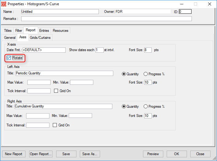
Move to the Axes tab to specify your X-axis for the histogram/S-curve graphs. Now you can select a date format for intervals, a font size, and if dates are to be shown for every X-axis interval or if you prefer another display (for example, every second interval). You can also rotate the axis text by marking the rotate checkbox.
Specify Left and Right Axis
The Left and Right Axis may be formatted individually, and Safran Project lets you report on Quantity and Progress %.
The Left/Right Axis fields are:
| Field | Description |
|---|---|
| Title | User-defined axis description. |
| Quantity/Progress % | Select if the data presentation is to be Quantitative or Progress-related. |
| Font Size | Character size of axis description and annotation in points. |
| Max. Value | Locks maximum value on relevant axis to value entered. If left blank, Safran Project auto-scales this axis. |
| Min. Value | Locks minimum value on relevant axis to value entered. If left blank, Safran Project auto-scales this axis. |
| Tick Interval | User-defined interval. Safran Project calculates the tick interval to fit the scale if left blank. |
| Grid On | Draws a horizontal grid line for each major tick line on the axis. |
Using the minimum and maximum axis options can help the readability of your report. Use the maximum value when the project is in the startup phase and the minimum value when the project gets closer to completion.
Include Datelines and Shaded Areas
Grids and curtains can be added to highlight specific events or periods, such as last cut-off, baseline(s), period/date for selected milestones, or a period/event for a project like tow-out, shutdown, or a project phase. Making it easy to use, customize, and navigate, the Grid/Curtains tab is divided into five tabs: Grid, Activity Grids, Curtains, Horizontal Grids, and Horizontal Curtains.
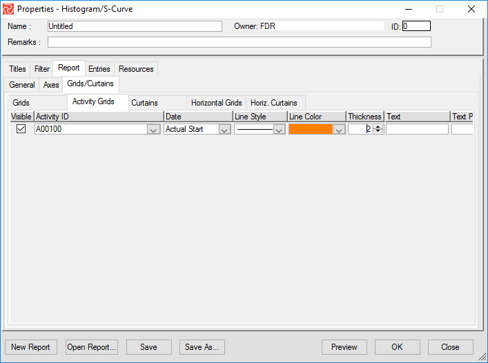
To include a curtain or a shaded area, use the Curtains tab. A curtain area is defined by both a start date and a finish date. For all grids and curtains, you can specify color, text, line style, etc.
Graph Data
You can select from 21 data entries and specify their presentation. All entries can be selected for periodic bars and periodic lines.
| Entry | Description/Definition |
|---|---|
| Baseline Plan, Early | Baseline plan (scope) using early baseline dates. |
| Baseline Plan, Late | Baseline plan (scope) using late baseline dates. |
| Baseline Scope | Baseline at Completion scope. |
| Burn Down Baseline | Remaining work left to do according to your Baseline. |
| Burn Down Current | Remaining work left to do according to your Current plan. |
| Burn Down Live | Remaining work left to do according to your Live plan. |
| Cost Variance | Baseline earned - Expended (all). |
| Current Plan, Early | Your statused plan using early start/finish dates. |
| Current Plan, Late | Your statused plan using late start /finish dates. |
| Earned | Earned manhours or cost. User-defined scope. |
| Estimate at Completion | 9 different formulas for Estimate at Completion are available. See the Forecast and Estimate at Completion section and the section later for details. |
| Estimate to Complete | Baseline budget/scope - Earned from Baseline scope. |
| Expended | Expended as reported. If you report actuals at a detailed resource level, you can also present expended on different scopes. |
| Forecast | Scope and dates as computed by the Forecast option. |
| Live Plan, Early | Project live plan early (activities early start/finish). User selected scope. |
| Live Plan, Late | Project live plan late (activities late start/finish). User selected scope. |
| Original Plan, Early | Your initial baseline, using the early dates. |
| Original Plan, Late | Your Initial baseline, using the late dates. |
| Over/Understaffing Baseline | Comparison of actual manpower (full-time equivalents) compared to your baseline manpower plan. |
| Over/Understaffing Live | Comparison of actual manpower (full-time equivalents) compared to your live manpower plan. |
| Remaining work | Baseline scope/budget - Earned (baseline). |
| Revised Plan, Early | Revised plan, as set by the Set Revision option, using early dates. |
| Revised Plan, Late | Revised plan, as set by the Set Revision option, using late dates. |
| Schedule Variance | Earned - planned. User-defined scope. |
| Scheduled Plan | Using the Resource scheduled start and finish dates. User-defined scope. |
| Variance at Completion | Baseline - Estimate at completion. |
Graph Entries
As mentioned, you can add periodic bars, cumulative lines, and table data to your Safran Project Histogram and S-Curve report. You can combine any of these entries on a single report or create reports that contain only periodic bars or only line graphs. A table entry is included when you add a periodic bar or a cumulative line by default. This can be removed, and others may be added with data that isn’t shown graphically. This adds a lot of flexibility to customizing and configuring your reports. However, the table entry is not removed when removing a Periodic Bar or Cumulative line entry.
For each of the three entries, Safran Project provides a tabbed interface that lets you further detail and specify each entry. The Main and Layout tabs allow you to set the presentation of the bar, line, and table entries, which will be discussed in more detail later in this section.
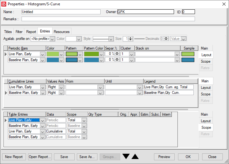
The Scope tab allows you to select different scopes for some of the entries selected. For user-defined scopes, you can also enter the quantity type and specify whether to include the original scope and any variation order types.
The Rates tab is only accessible if you specify to report on cost and your project is set up to use complex rates. If so, you can detail what rate elements will be included for each entry. The cost elements are Direct, Head 1-4, General & Administration, and Cost of Money.
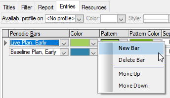
To Add/Remove Entries
Whether it is a periodic bar, Line graph, or table entry, you can right-click in the entry type area to access the short-cut menu and then add/remove a new bar, line, or table entry. You may also move the items up and down to fit your needs.
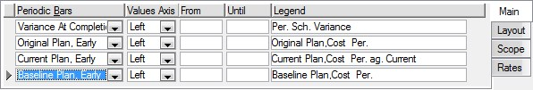
The Periodic Bars
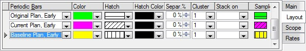
The Periodic Bar can show periodic values for quantity, manpower, or cost. You can restrict the periods shown on the report by adding a From and Until date and writing your legend for the entry. You can also select bar color, pattern, and pattern color, specify bar separation, and present a clustered or stacked bar report.
Specifying the Periodic Bar
Highlight the bar entry and use the tab-separated Periodic Bar entry panel to specify or modify the legend, layout, and scope.
Use the Main tab to select the entry data and value axis, specify a date range using the From and Until date fields, and, if required, edit the description. By setting a date range for the entry, you can draw bars for a limited period that may differ from the overall report span defined for the total report.
Use the Layout tab to specify appearance, color, pattern, % separation, stack on, and value for cluster.
| Field | Description |
|---|---|
| Separation % | Specify bar offset. |
| Cluster | Specify if the bar will be split into separate elements for each value. |
| Stack-On | Specify if bars are to be grouped/drawn next to each other. |
For stacked elements, you can specify if table data is to show totals or value-per-stack elements. Select this option on the Layout tab of the table entries. When you have more than one periodic bar to stack on, the second or the third bar may be hidden behind the former bars. In such occasions, you can reduce the width of the bars in front by adjusting the Separ.% and letting the hidden bar become visible again.
The Scope tab allows you to specify a bar for manpower or quantity and select QTY type and variation orders. Some of the data elements are locked to show only specific scopes.
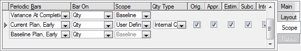
The scope elements in the Bar Properties - Scope tab are the same as defined in the Quantity Configuration Panel (Baseline, Current, and Total).
Additionally, you may also choose the 'User-defined' scope. The user-defined scope allows you to select any combination from the Original scope, Approved VOs, V.O. Requests, Internal Changes, and Subcontracted.
Finally, the QTY type may also be chosen. This specifies whether Internal (planned) or Contract QTY should be used for the report.
- Both Original and Baseline plans always use the Baseline scope (CSH).
- The Current plan always uses the Current scope (RSH).
- The Revised Plan always uses the Revised Scope. The revised scope is set at the first Plan Revision.
- The Forecast plan uses the 'forecast scope' defined when running the Forecast process and could be Baseline, Current, or Total Scope. Changes do not apply to any of the above plan sets.
- The Live Plan, Scheduled Plan, and Earned Value may be compared to Baseline, Current, Total, or a User-defined scope.
S-Curves and Cumulative Lines
The S-Curves can show percentages or quantity for both cost and manhours. In addition, some data elements show the computed value at each cut-off, for example, Cost Variance, Estimate at Completion, or Baseline Scope. These lines and entries can be used to produce reports with different values for Estimate at Completion and compare these to your baseline to compare various statistical forecasts to assess your estimate at completion realism.
The Scope entries can be used to monitor your progress against your baseline plan and determine if you are ahead of or behind schedule.
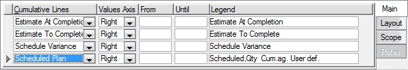
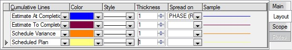
Specifying the Cumulative Line
As with the Periodic Bars, you will use a tab-separated panel to configure the Cumulative Line. You may specify both the data source and the appearance of the line.
To do this, highlight the Cumulative Line required. Use the Main tab to select a plan, select the value axis, specify from and until date if you want to limit the span of the entry, and edit the legend if required.
Use the Layout tab to specify color, style, and thickness. You may choose from 5 different line styles, specify line thickness from 1-24, and select from 32 different colors.
Spread On
Spread On is an advanced feature that allows you to group data and present individual curves for these items on a single sheet. This is especially useful to draw s-curves for the project phase, as it allows you to verify that work and phases are planned logically.
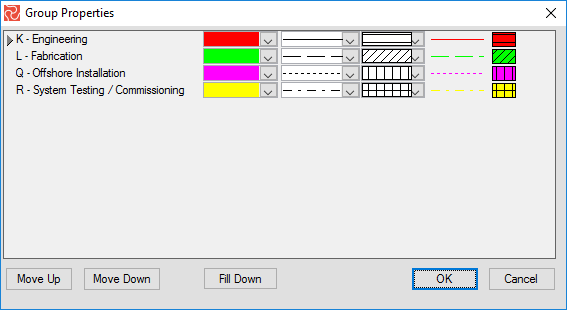
Specifying Color, Pattern, and Line Style for Stacked and Phased Data
In the bottom of the properties window, choose Group Properties to specify your color, line, and pattern style for each stacked bar or phased spread on the curve entry.
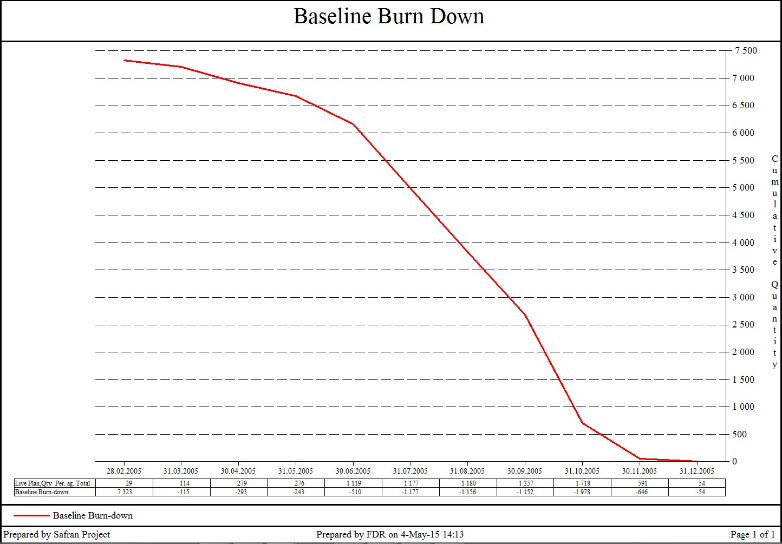
Burn Down
In addition to the traditional S-Curve cumulative line, Safran Project also lets you create Burn Down charts. A burn-down chart is a visual representation of the amount of work that still needs to be completed before the end of a project. A burn-down chart has a Y-axis (work) and an X-axis (time). Ideally, the chart illustrates a downward trend as the amount of work still left to do over time “burns down” to zero. Safran Project lets you draw a burn-down chart for baseline, current, and live plans.
The Table Graph
By default, the table is populated with entries corresponding to the entries you define for the periodic bar and cumulative line. However, these may be removed, and you may add table entries not shown as bars or lines.
By selecting a different option on the report General tab, you can also specify table data for intervals different from those presented for the bars and lines. For example, you can draw the graph to show entries for every week but only show table entries for every four weeks.
You can also export the data from the table to an Excel-type file by selecting the ‘Copy Table’ option from Print Preview. You should note that these data represent periodic aggregated data using calendars, work periods, and resource levels. Creating these data in other applications is far from easy. The Save Table Data option lets you deliver periodic and cumulative data for others to play with.
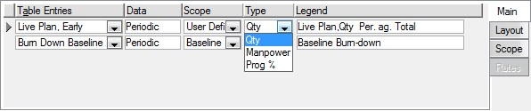
Specifying the Table Graph Layout
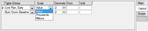
By default, Safran Project adds a table entry for each element specified as a Periodic Bar or Cumulative Line. Additional table entries may be added and customized using the tab-separated pane. The <Min tab lets you specify data (cumulative or periodic), select scope, data type (QTY, Manpower, Prog %), and legend.
The Layout tab lets you specify value appearance (Scale) and number of decimals. You can also restrict the span of table-only entries by specifying from and until dates. If any of the bars are stacked, you can also specify if the table is to contain total values or values per stack element.
Resource Availability
Using the availability option, you can define resource availability for your project. You can use the availability to perform resource scheduling or leveling. Please see the ‘Resources and Cost’ chapter on defining availability and the ‘Time Analysis & Scheduling’ chapter on scheduling and scheduling options.
Using Safran Project, you can show availability as a profile for manpower or quantity. When you add the availability profile, it is easy to assess the status of overload or underload.
Including Availability Line
On the histogram/S-curve, you can include an availability or resource limit line. This is specified at the top of the report entries pane. Availability may be shown for either quantity or manpower, and you can select color, line style, and size. The availability will also be included in the table area, hence the ability to specify decimals and values.

Selecting Resources
All reports let you specify selection criteria using activity-based filters selected from activity data. In addition, the histogram/S-Curve report enables you to produce specific reports focusing on all or only a fixed set of your resources. The default is ‘All Resources Selected’.
You can choose the resources by selecting the Resources tab and then drag-and-drop to include the specific resource(s). Resources may be presented as a list or as a hierarchy. The hierarchy is only for the selection of groups of resources and does not form a summary structure. The resource hierarchy can be set up as part of your resource definitions.
The resource filter works in addition to the filter selection based on activity data fields. If no resources are entered under selection, all resources will be considered during the processing of the report.