Distribution Graph
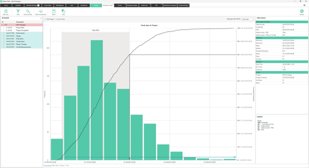
When you run the risk analysis, Safran automatically generates a Risk Histogram for finish date, start date, duration and cost.
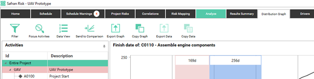
The distribution graph is by default displayed for the entire project; however, you may choose to see the results an activity or a summary.
When you select one activity, Safran shows only the histogram and the related information for that activity.
If you have entered costs in the cost tab you will see two extra icons. One for the Schedule and one for the Cost. To see the results for the schedule you click the Schedule icon and to see the results for the Cost tab you click the cost icon.

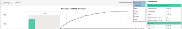
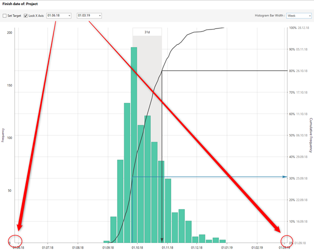
The histogram bar width can be changed in the area above the graph. The bar width is set to Automatic by default. For Finish Date, Start Date and Duration you can also set it to Minute, 15 Minutes, Hour, Day, Week, Month, Quarter or Year, depending on your need. For cost only automatic can be chosen.
Information pane
Depending on which result type you select, either Finish Date, Start Date, Duration or Cost, the information pane provides you with the related information from the analysis results. The information pane consists of four main areas:
Result Type of Product Part
- Deterministic Value: The value from the schedule tab or the cost tab
- Probability: The likelihood of achieving the deterministic value
- Annotations
Here the values of the arrow and curtain annotations are shown. See below for details on how to set them up.
Statistics
- Minimum: The earliest (finish and start date) or lowest (duration and cost) value
- Maximum: The latest (finish and start date) or the greatest (duration and cost) value
- Mean: The mean value
- Median: The median value
- Standard Deviation: The amount of variation in days or cost
- Mode: The value of the bar with the highest number of iterations. Note that this value might change when changing the bar width.
- Skew: Shows how symmetrical the date/cost distribution is in your model. in the skew in a symmetrical distribution = 0, right sided asymmetrical distribution = positive skew, left sided asymmetrical distribution = negative skew
- Kurtosis: shows how the data distribution matches the normal (Gaussian) distribution. Kurtosis is 0 when data distribution matches the normal distribution, Kurtosis is negative when data distribution is flatter than normal, while it is positive when the data distribution is more peaked than normal
Analysis
- Start Time: The time the analysis started
- Run Time: The time it took for the analysis run.
- Iterations: Shows how many simulations have been run against the current risk model
Model
- Project: The name of the project
- Project Timenow: The Timenow date of the project.
- Activities: The number of activities involved in the analysis process
- Risks: The number of identified risks
If you would like to use the results from this analysis to compare against other scenarios or save these results for comparison at a later time you can send results to the Distribution Comparison report by clicking the ‘Send to Comparison’ button on the ribbon. You also have the ability to export the graph as an image or copy it to the clipboard.
More information on the ‘Send to Comparison’ function can be found in section ‘Distribution Comparison’.
Activity Tree
In the activity tree you pick the Activity or WBS that you are interested in seeing the results for. The tree will have the same content and grouping as the tree in the schedule tab. In other words, the activity list will change when you change the view (Outline View/Group View), the layout, grouping and/or filter in the Schedule tab.
If you want to quickly filter it down further, you can click on the Filter Icon.
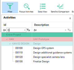
This gives you some textboxes in the id and description columns where you can type in what you’re searching for. As default the filter will try to find rows that start with the text you’re typing. For other options, such as finding rows containing a text you can click on the “Aa” symbol.
Another way to filter is to only show your focus activities. To do this you just click the Focus Activities icon.
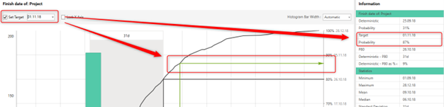
Target
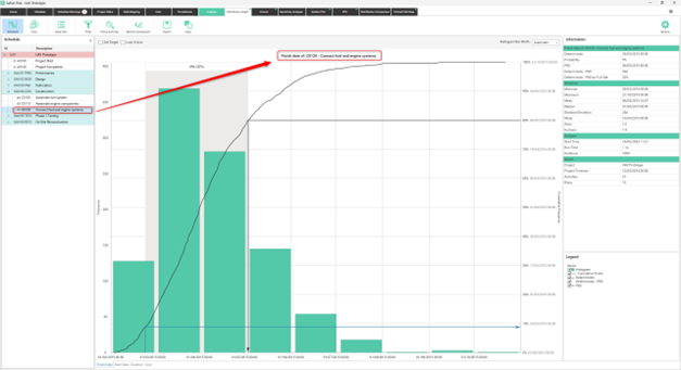
If you want to know the probability of a certain value (eg a date in the Finish Date graph) you can select the “Set Target” check box and select a value. When this is done you will see the target displayed in the graph and in the Information table.
Lock X-Axis
By checking “Lock X Axis” you can set the start and finish of the axis to some custom values. This can be useful when visually comparing different graphs.
Graph Options
You can set a number of properties for the graph, such as color and line width, in the Options pane.
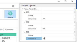
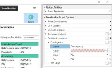
Focus Percentiles
Safran Risk lets you set percentiles that are used to display information about the output distributions. These can be set in the Options pane. The same percentiles can also be changed from the Sensitivity Analysis and the Distribution Comparison tabs.
Graph Annotations
There are two types of annotations that can be added to the distribution graph. Arrow and Curtain annotations. Arrow annotations visually connect a value on the x-axis to one on the y-axis, for example it can show the probability of the deterministic value or it can show a certain percentile. Curtain annotations highlight the difference between two values on the x-axis.
To add or modify annotations you go to the Options pane. To add a new annotation, you click on the + to the right of Arrow Annotations or Curtain Annotations. To remove an annotation you click on the – next to that annotation. The values you can select in the From and To fields are Deterministic, Mean, and the Percentiles that you’ve set up under the Focus Percentiles section.
The annotations will be shown visually in the distribution graph and as values in the information grid.
Data View and Post-Analysis
By clicking on the Data View icon in the Distribution Graph, you can see the values that the Curve and Histogram were created from. The values are presented in a grid where each line is an iteration during the risk analysis. On each line you can see the Finish Date, Start Date, Cost and Duration for that iteration. You can also see which risks impacted the plan during that iteration, and by how much.
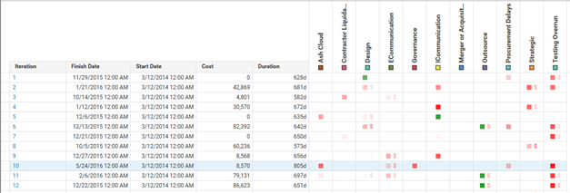
Risks impacting the duration have a square and risks impacting the cost has a dollar sign. Red means that the impact was negative (longer duration / higher cost) and green means that the impact was positive. To see the exact value of the risk you can hover the mouse over a cell. If the risk is set to impact independently a grey square is shown. This is because the risk might have impacted activities differently during the same iteration.
If you want to see what the plan actually looked like during a particular iteration you can just click on the number in the leftmost column. This takes you to the schedule tab where the plan is shown as it was during that iteration. This can be a very efficient way of verifying that your risk model has worked as expected.
When you select an activity (or summary) in the tree on the left side, the values for that activity will be shown in the grid. The risk impacts will always be the same whichever activity you select. However, the risks not impacting the selected activity directly will be greyed out.
If you want to use the data from this view in another tool you can click on export data or copy data. Export data exports the data csv file. Copy data copies it to the windows clipboard in a format that you can just paste into for example Microsoft Excel.