The Bubble Chart
The Bubble Chart is a program, portfolio, and multi-project report that visualizes the project performance in a bull's-eye quadrant. A bubble chart displays three dimensions of data. The vertical position represents the budget status (over or under budget); the horizontal position shows the schedule (behind or ahead of schedule); and the third dimension is the bubble size, representing the baseline budget. The bigger the bubble, the bigger the scope of work approved at the last baseline.
While the bull's-eye report shows you the trend over time for projects within your portfolio, the bubble charts show their relative size and performance status.
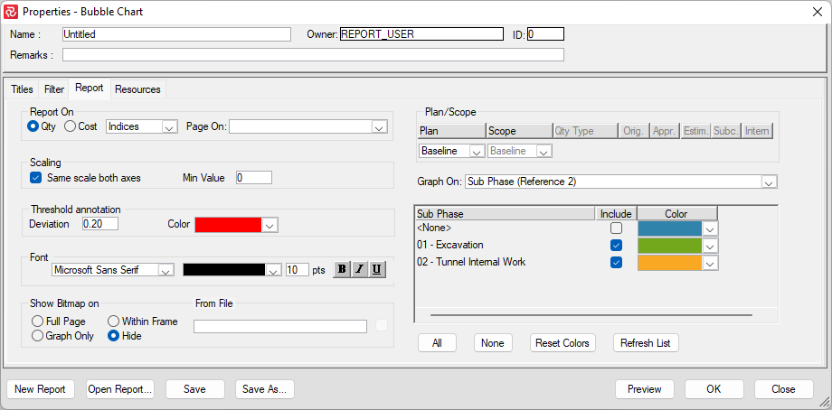
The report configuration panel lets you choose the color for each project in your group and also includes a checkbox allowing you to contain or exclude a project from the report.
As with the Bull's-eye reports, you can position projects according to indexes or factors. If you select indices, the upper-right corner is the favorable position. Of your select factors, the lower-left corner becomes the advantageous position.