Customising the Barchart View
The Barchart Editor window comprises an editable activity field portion and a time-scaled barchart. You may choose the fields that should be presented, configure activity bars, and modify the various elements of the barchart. If you prefer to work in a graphic environment, you can display more of the barchart and less of the activity columns. If you prefer to work in a spreadsheet-like environment, you can display a small portion of the barchart.
The configurable barchart elements are found under the main menu options HOME and VIEW. Right-clicking the mouse can access sensitive short-cut menus to configure the Barchart Editor.
Formatting the Columns Area
Formatting or customising the activity columns area involves selecting the fields or columns to be displayed, defining their headers, adjusting the column width, specifying column alignment, and setting row and header font attributes.
Default Field Formats
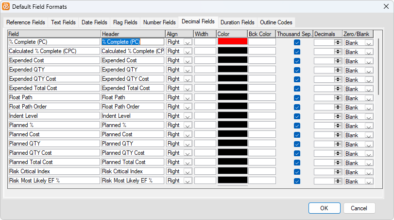
Safran has its default field formats that appear each time you choose a field to include in your layout. Typically, fields are displayed uniformly with black text on a white background, a header equal to the field name, and so on.
If you frequently change the same properties for a field or number of fields after using Safran for a while when setting up a new layout, it might be worth considering defining your default field formats. By doing this, you can save time creating new layouts and provide a more uniform, tailored, or expressive 'look and feel' to your Barcharts.
The user-defined default field formats are stored in an operating system text file on a user-by-user basis so that each user can have their defaults.
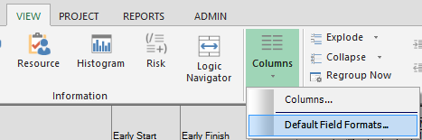
Use the Default Fields Formats option VIEW/Columns/Default Field Formats to define your defaults.
The default field format window has a separate tab for each field or column type. The various field types will have varying properties, each relevant to the field type, i.e..... Decimal and Number types will have a 'thousand separator' property, while Date type fields will have a date format property.
The format properties you enter into this panel will be applied whenever you add or insert the column into the Barchart Editor layout. Remember that entering/changing a default field format property will not affect fields already chosen on an existing layout.
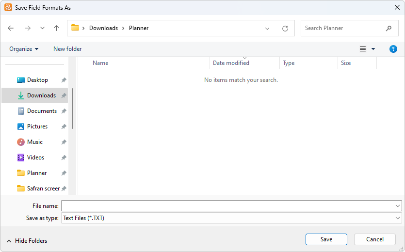
If a default field format file does not exist, you'll be asked to choose a location and a file name for the file, as shown below:
The default field format file may be located/modified by opening Project/User Settings as shown below:
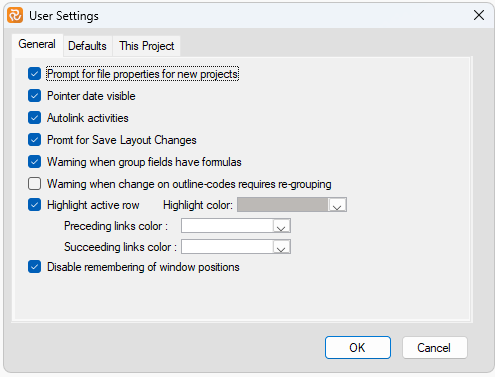
Remember that if a standard company-wide set of defaults is relevant, the file could be located in a central file store. Each user could then open their User Settings and find the main file.
Selecting Information for the Tabular Columns
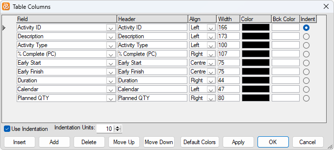
Use the Columns option under VIEW on the main menu to specify activity fields to be displayed in the tabular columns. Press the New button to add a new field to the columns area, select your own columns header, choose alignment, set column width if other than default values are to be used, and specify the field to be indented if the barchart is organised by summary groups. The left-to-right order of columns can be changed using the move-up or move-down buttons. Remove columns by first selecting a column and then pressing the delete button. The order of columns presented, left to right, is the same as their order in the list, top to bottom. You may also specify a colour for column text and a background colour to highlight unique interest columns.
The column header automatically wraps as you reduce the column width.
When arranging the tabular area of the Barchart Editor, options are available from a short-cut menu. To access the menu, position the cursor in the heading area and right-click the mouse button. The following options are available:
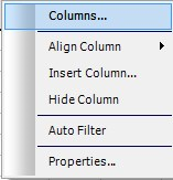
Columns: Select the columns window. Please see above.
Align Column: To specify the column data placement. Options are Left, Center, or Right. The align column option adjusts both the column heading and data content.
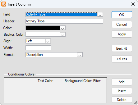
Insert Column: Insert a new column to the left of the column pointed at in the header area. The data field to be inserted is selected from a drop-down list, and several column properties can be specified, such as header, colour, background colour, alignment, and column width. By choosing the Best Fit option, the column width will be sized to fit the maximum number of characters entered for the data field selected.
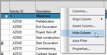
Hide Column: To remove a column from the Tabular area, select it by clicking the column header and then selecting the Hide Columns option from the shortcut menu.
Properties: To specify column properties for a single column, such as header, alignment, colours, column width, or the Best Fit option. The features available in this window depend on the field type for which you are setting the properties.
Field Format Modifiers
All fields available as columns within the Barchart editor share a common set of flexible visual properties such as Text/Background color, Width, and Alignment in addition to Conditional Colors.
Certain fields and field types have an additional property called a Format modifier.
Some of the most obvious modifiers are the Date Format for date fields, the Duration Format for duration type fields, and the Yes/No or 1/0 formats for Boolean/flag type fields.
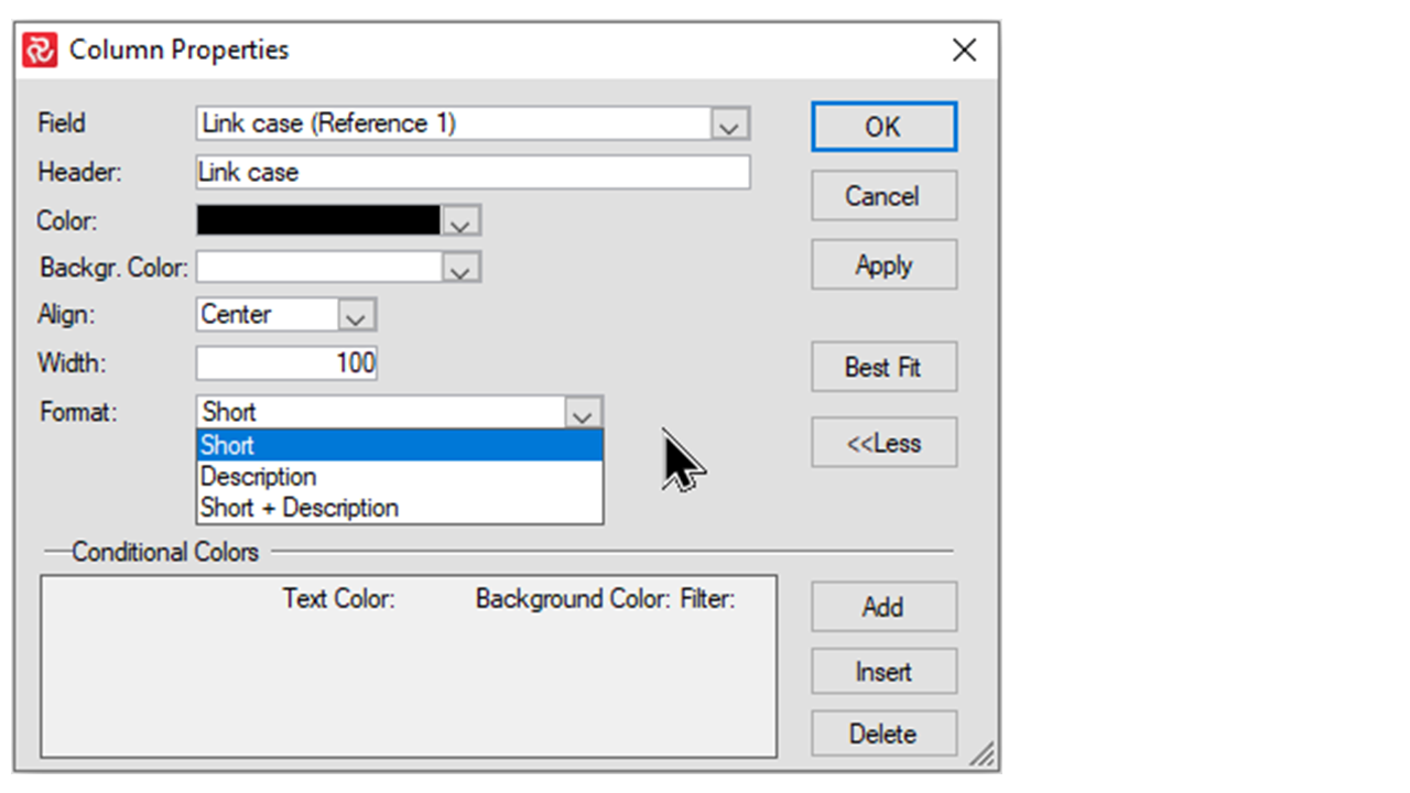
Other field types may have related information. Examples of such are the Reference, Outline Code and Activity type fields that consist of both a Code and a Description.
The Logic fields Predecessors and Successors have the most comprehensive set of related information, typically Type, Lag, Calendar, Split Target and so forth.
Format modifiers allow you to choose the format or related information you want to present.
The Format modifiers may be found on the Properties panel for each field by right clicking in the header area for the field in question and selecting Properties or by double-clicking the header area for the field.
Date
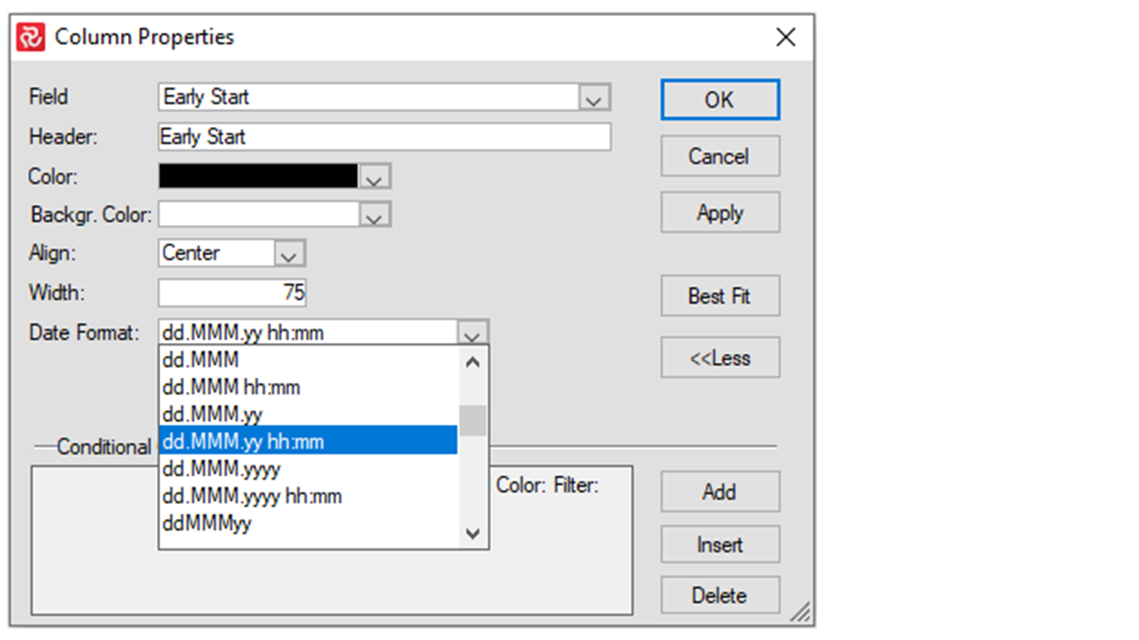
The Date Format modifier allows you to choose from a multitude of date/time formats.
Duration
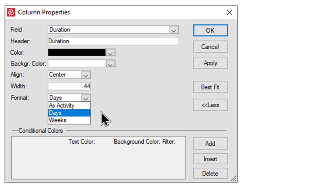
The Duration Format modifier allows you to present a duration type field in Days/Weeks or in the same format as the relevant activity. If your calendar is Hour/Minute based Hours and Minutes will also be relevant format modifiers.
Boolean/Flag type fields
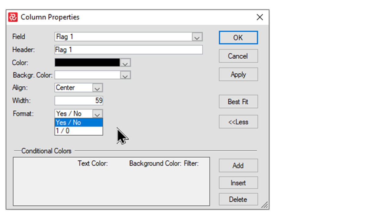
User-defined flag fields may be formatted to show either 1/0 or Yes/No. This option also applies for Boolean system fields such as Out of Sequence and All Predecessors Complete**
Decimal type fields
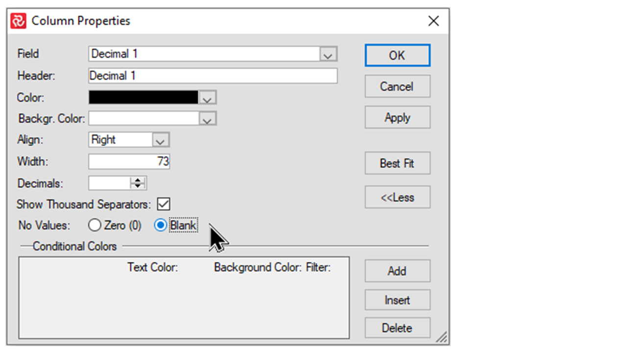
Decimal type fields both user-defined and system fields allow you to choose between presenting a Zero or blank at activity/summary levels when no values (Null) are present at the activity level for the group.
Reference field/Outline Codes/System fields
For fields that consist of a code/short value and a description, you can choose between showing the code, description or both code and description. These options are typically available for Reference fields and Outline Codes, however certain system fields such as Calendar and Activity Type also have these types of modifiers.
Logic fields Predecessors/Successors
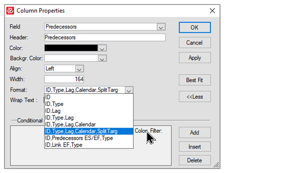
In Safran the logical link fields have a wide number of properties and related information. In order to make your barcharts more informative and meaningful, you are allowed to choose the link information that is most relevant for the audience of your report.
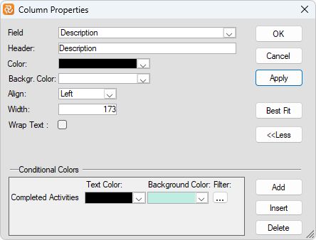
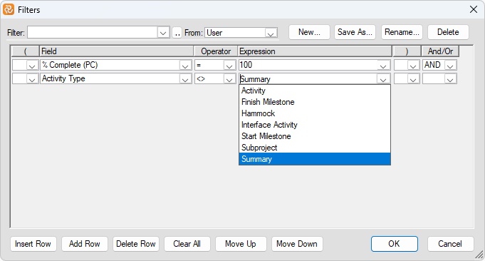
Conditional Colors: Pressing the 'More>>'/'<<Less' button on the Column Properties panel expands/collapses the panel and allows you to define differing text/background colors for column cells depending on column values. Press the 'Add' or 'Insert' button to add a new Conditional Color, and then press the 'Filter' icon to add a relevant filter.
In the example below, the 'traffic light' type functionality highlights the Actual % value for activities or behind schedule by adding a filter for each 'case.' Actual % for activities on schedule would, in this example, be presented in the Color/Background chosen for the Column.
Add a filter to each conditional Color:

The filter and settings above will give you this result:
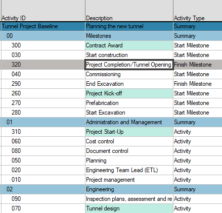
Remember that the above properties apply to any aggregated/group-level value. In some cases, this might not be desired. To ensure that the conditional colors are only used for the activity level, add an argument to your filter, such as 'Activity Type <> Summary' or 'Activity Type=Activity,' as shown below.
Note: We suggest using Font to color an entire row instead of a cell.
Re-arranging Columns Using the Mouse
You can also drag and drop in the tabular area to rearrange the field or column order of the selected fields. Position the cursor in the field header, press the left mouse button to select the column, and drag it to its new position.
Resizing Columns Using the Mouse
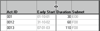
Point to the vertical line on the right side of the column header. When the pointer changes to a double arrow, drag the bar to the left or right to adjust the width. You can hide a column by dragging the vertical line to the left, which sets the width to zero. To show the column again, choose Columns and change the width. To size a column to fit the broadest column data entered, point to the vertical line at the right side of the column and double-click with the left mouse button.
Choosing Font and Colour
Choose Fonts to change the colour and font for table rows and column headers.
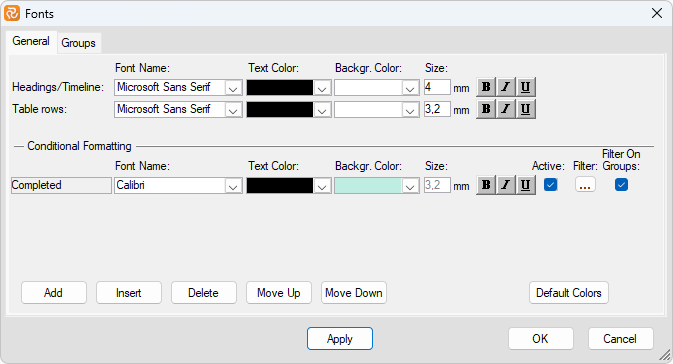
Select font names and colours from the drop-down list, and press the font attribute buttons to specify bold, italic, and underline. Attributes selected for the headings also apply to the timeline.
Colouring
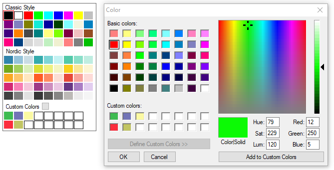
Safran offers a large selection of standard colours that may highlight text values, symbols, and graphic elements throughout the system reporting facilities.
In addition to standard colours, Safran allows you to define your custom colours. Press the grey button to the right of Custom Colours to specify custom colours. A new panel for selecting colours is presented. A primary colour is shown by pointing to any area of the colour selector. You can 'tweak' your colour by moving the pointer of the scrollbar to the right, up or down, or even by entering specific values for Red/Green/Blue and Hue, etc.
When you press the Add to Custom Colours button, your colour will be added to the Custom Colours panel and available throughout Safran.
Conditional Colouring and Formatting of Rows
The Conditional Formatting feature allows you to specify particular font and colouring properties to highlight activities meeting certain conditions. Use the Filter button to determine conditional character and colour formatting conditions. In the example below, 'delayed activities' will be highlighted with a yellow background due to the filter expression checking for activities where the Early Start date is later than the Baseline Early Start date.
Note that 'Activity Type <> Summary' has also been specified to suppress Summary activities from being presented with this format.
In the case of using both Conditional Formatting and Conditional Colours (see Formatting the Columns Area in the previous chapter), the colour and background properties chosen in Conditional Colours will have priority over those of Conditional Formatting.
Font Properties for Groups
If you use a summarised layout, i.e., group properties are defined. You may also define colours and fonts for the summary rows/group levels. You may add background colour to summary rows or groups to separate group information from activity rows and enhance output from the Barchart Editor.
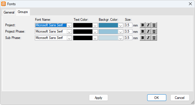
When you specify group properties, you can also set a line style and thickness as the summarised group's final line.
See Define Group Levels for more information on Group Properties.
Conditional Colouring and Formatting of Groups
The Conditional Formatting feature also allows you to specify particular font and colouring properties to highlight Groups/Summary activities meeting certain conditions. Use the Filter button to determine conditional character and colour formatting conditions.
Consider the example below:
- activities with an enormous scope (over 4500 hours) will be highlighted in red/bold font on a light grey background.-
- The summary line for groups of activities with a sum of more than 20000 hours will be formatted in black/bold on a yellow background.
Note that 'Activity Type = Summary' has also been specified to ensure Summary activities are presented with this last format.
The formatting and filtering options above would give the following result:
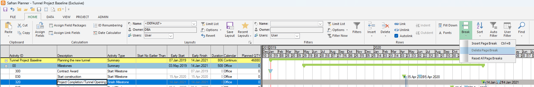
Controlling Page Breaks
Safran lets you control page breaks for printed output by applying a page break for level one of your group properties or inserting a page break between two activities. To use a page break by level one in your group structure, mark the Page Break checkbox in the Group Properties window. To insert a page break between two activities, position your cursor in one of the displayed columns for the lowest of the two activities and press CTRL+B, or select the Page Break option from the EDIT menu. Safran will insert a page break above this activity. The page break is shown as a dotted line. Page breaks may be removed by selecting Remove Page Break (CTRL+B) or by unchecking the box in the Group properties window.
Formatting the Gantt Area
The Gantt area is the graphical part of the Barchart Editor. Safran Planner lets you customize the editor's appearance with a company standard or a personal style. Formatting includes symbol definitions and visibility, calendar timelines, grid lines, rest periods, logic displays, and more.
Adjusting Timeline Scale
The timeline is the calendar heading at the top of the barchart. The timeline includes three lines usually used to identify the significant timeline from the minor timeline.
The primary timeline displays larger units of time, while the minor displays smaller units of time. For example, if the major timeline shows years, the second line displays project or calendar months, and the minor timeline displays the dates or days of the week.
Changing the time scale density only affects the information displayed on the barchart. It does not affect the schedule or activity durations.
To adjust the Timeline scale, choose Timeline from the VIEW toolbar or point at the timeline and press the right mouse button to access the short-cut menu.
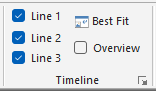
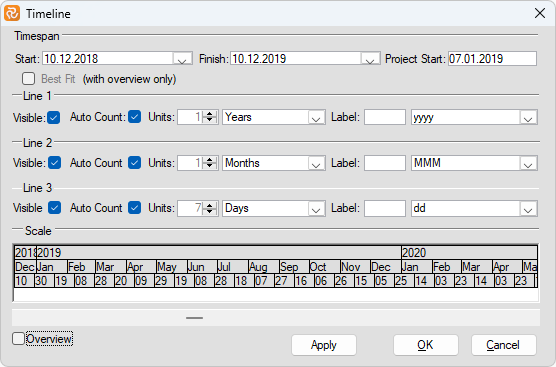
Specify start and end dates to control the total period of the barchart view. Lines 1-3 entries identify visibility, units, labels for the calendar lines, and marks for timeline units.
The overview option sets the Barchart Editor view's timespan to fit your project. Please keep in mind, however, that choosing the "Overview" option also switches off the Barchart's interactivity; i.e., you cannot modify activity duration or start/end dates graphically on screen.
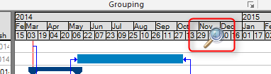
The Best Fit option sets the calendar line for your output to fit with the total span of your project. It is a valuable feature when you want to adjust the work according to the time spanned by your schedule. You can manually adjust the Best Fit position using your mouse pointer when it changes to a magnifier on the timeline.
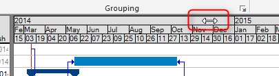
You can adjust the timeline's horizontal position. To do so, move your mouse pointer on the timeline (the cursor will change to a small two-headed arrow), click and hold, and then drag the timeline to the left or right.
Showing Timenow
Safran Planner allows you to add a Timenow dateline to your barchart view. To specify colour, line style, etc., use the Timenow option in the VIEW toolbar or from the short-cut menu in the bar area.
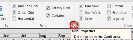
Formatting Grid Lines
Grid lines are vertical and horizontal lines that improve the readability of your barchart. Vertical grid lines may be displayed for year, month, week, and day. Horizontal grid lines are drawn across the barchart to separate each row. To specify grid lines, use the Grid option under VIEW from the main menu or the short-cut menu in the bar area.
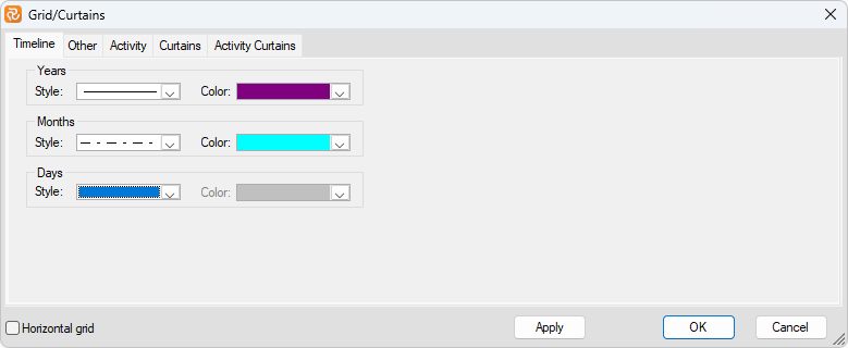
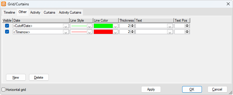
Safran also lets you add user-defined datelines to be drawn as vertical lines across the barchart. From the Grid window, choose the 'Other' tab to specify a date and text label, and select colour, line style, and line thickness for the specific grids you want to show. Note that to make the grids visible in the Gantt chart, you should tick the checkboxes in both the Grid window and the VIEW ribbon.
You may even want to draw vertical grid lines from any date field for specific activities, like Project or Contract Milestones.
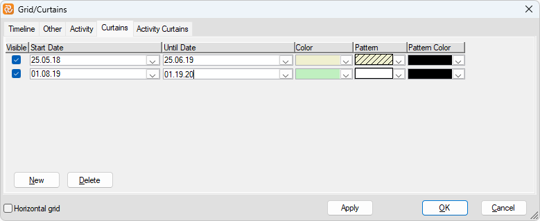
Using the Curtain tab, you can define shading for a specific portion of the layout when you view or print the layout. Shading appears between the start and end dates specified. You can also select colour, pattern, and pattern colour to be applied to the area. The Curtain feature may highlight periods of particular interest, such as a shutdown period, a tow-out period, the commissioning period, and more.
Show Rest Periods
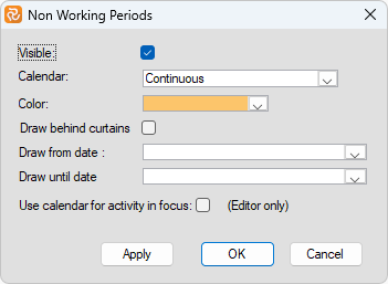
Safran Planner provides several methods to show when no work is planned to take place. You may define activity bars to be necked instead of setting a minimum rest period for drawing a neck. For example, this could be applied if you do not want bars to show regular weekends as a neck. Next, you can define a group of summary bars to be necked, drawn, detailed, or summarised. The graphical area can also highlight rest or non-working periods for a selected calendar. Click on the barchart site, select the Non-Working Periods option from the short-cut menu, select calendar, and specify a shading colour.
Formatting Activity Relationship Lines
By default, Safran Planner draws the logical link between activities. If you, for some reason, do not want to show activity logic or dependencies, you can change this by selecting the Links option and removing the visible check mark. Safran lets you draw the logic from any combination of activity dates, provided a corresponding bar symbol is defined. If you specify logic using the Baseline Early Start date as the Start field and the Baseline Early Finish date as the Finish field, a symbol spanning the exact dates must be defined and visible.
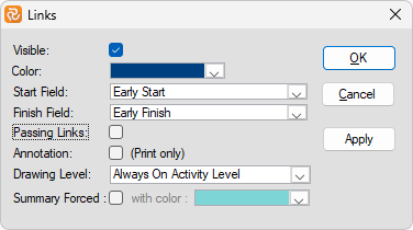
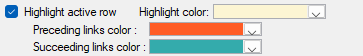
The colour for drawing links may also be modified to suit your standards. By marking the Passing Link check box, links to off-page activities will be shown. For printed display, annotations (FS, SS, SF, FF) may also be specified by marking the Annotation checkbox. Please note that the Options dialogue window lets you select different highlight colours for predecessors and successors of activities. This gives you the effect that when scrolling down your barchart, the colour for links may change as you move from one activity to the next in the columns area.
Note: In 'User Settings' (PROJECT ribbon), you may also set some personal screen settings on how you would like to view links:
Displaying Links in Outline View
If you are working in Outline View, Safran lets you add logic between a summary bar and an activity outside this summary. Using this option, Safran allows you to display links from all activities within this summary group to the activity within another summary level. To do so, mark the Summary Forced checkbox and select a colour for these links.
Displaying Links in Group View
Using Group View, Safran allows you to specify at what level you want to display the logic. The default is activity level. Displaying logic at a higher level does not affect the project time analysis. It serves as an illustration for information only.
Highlighting Critical Activities
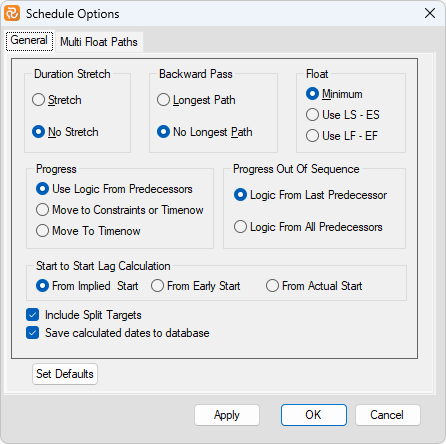
Safran Planner provides two methods for calculating the critical path. One way (No Longest Path) considers each flow of activities towards a final activity (i.e., an activity without a successor) as the starting point for the Backward pass. In contrast, the other method (Longest Path) considers the most extended flow of activities (i.e., activity with the latest Early Finish) as the starting point for the backward pass. This choice may be made on the Project Properties/Schedule Options/Backward Pass panel shown below.
In the Barchart editor, you may choose a colour to distinguish critical and non-critical activities. To do this, right-click in the Gantt area and select the Critical option.
Critical activities are, by default, highlighted with a red border, and critical logic is shown in red; however, you may choose any colour from the dropdown window to the right of the Colour option. By default, Safran deems an activity critical when its total float is equal to or less than zero. The criticality level may be lowered to include less-critical activities by entering several days float in the "Critical When Total Float" field.
Total Float will be calculated based on the abovementioned property chosen for the Backward pass.
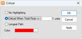
Suppose you want to override the Project Backward Pass property for a specific Barchart editor layout. You can do this by selecting the Longest Path option from the Critical panel, as shown below. By doing this, the activities on the 'shorter' paths are no longer considered critical, as Safran uses the latest Early Finish date as the starting point for the Backward Pass.
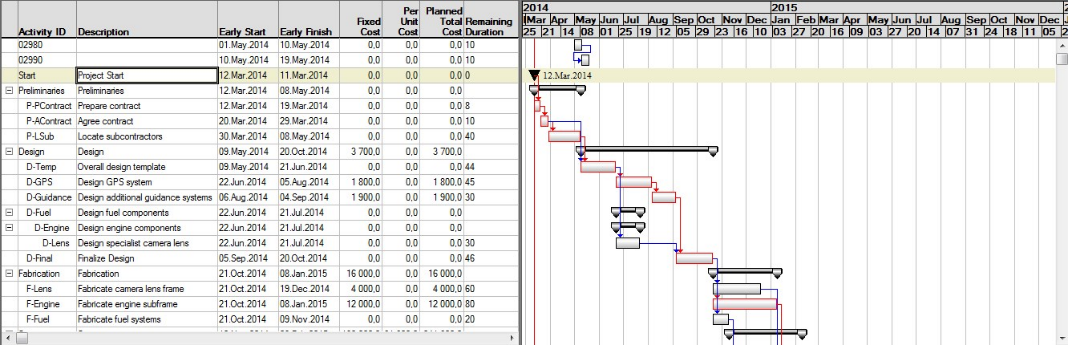
Additionally, Safran Planner provides you with the field Longest Path set to Yes for all activities on the Longest Path. It is available as a column in the Barchart editor and as a field that may be used in a filter. In the example below, the Longest Path field values are used in a filter to colour the field value green and have also been used to place the text 'LP' on activities on the Longest Path.
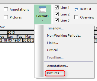
Add Pictures
Safran Planner allows you to add pictures (bitmaps) to highlight or decorate activities in the bar area. The images are positioned according to specified date fields and are additional to bar specifications. Select VIEW>Show>Formats>Pictures from the main menu. Press New, select Activity ID from the drop-down list, specify Bitmap file, or press the button next to the bitmap field to browse your system, then specify according to which date the picture should be positioned. You can also specify picture height in percentage of row height and row alignment. The Visible checkbox lets you turn visibility on/off without removing the picture entry from your system.
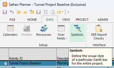
Customising Bars and Symbols
An essential characteristic of customising the Barchart Editor view is the ability to edit and define an unlimited number of symbols and include or exclude these from your layouts and view. A logo represents the bar record, dates to span, start and end characters, line position, colour, hatch, including text, and the ability to define conditional bars. Symbol definition and their visibility are stored with the Barchart Editor layout. Together, they are potent features for highlighting areas of your project.
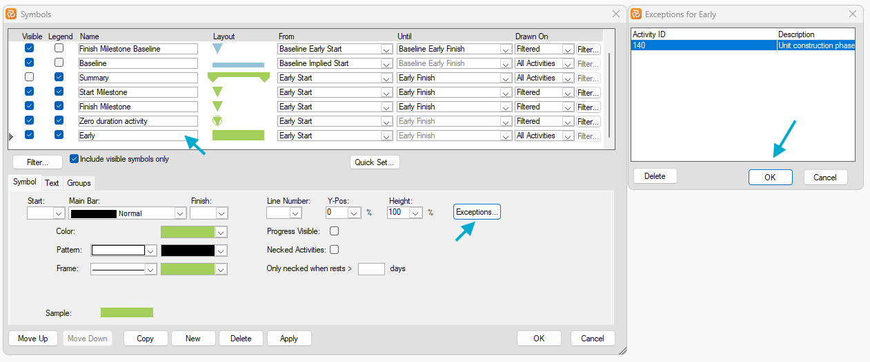
From the Barchart Editor, you can access the symbol set defined for your project by selecting the symbols option from the shortcut menu or the Symbols in the DATA toolbar. Safran then provides you with the symbols window. Now you can add, edit, or delete symbols.
When creating a new project from scratch, you may add Safran Planner Default Symbol Set to your project Setup. The Default Symbol Set contains the following symbols:
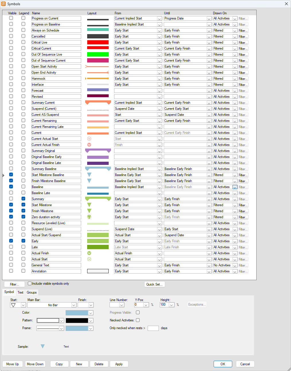
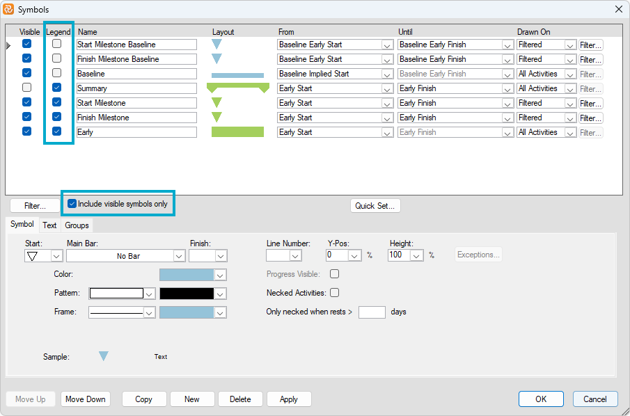
You can check the 'Include Visible Symbols Only' checkbox to limit the number of symbols in the configuration pane while working in the Barchart Editor. You can also mark a specific symbol to be visible only for your current layout on the current project.
NOTE:
Ticking the Visible and Legend boxes only applies to the current layout. However, if you modify a symbol, add/delete a symbol, or change the order (Move up/Move down), this will affect all users using the symbol set, so it will most likely affect all project users.
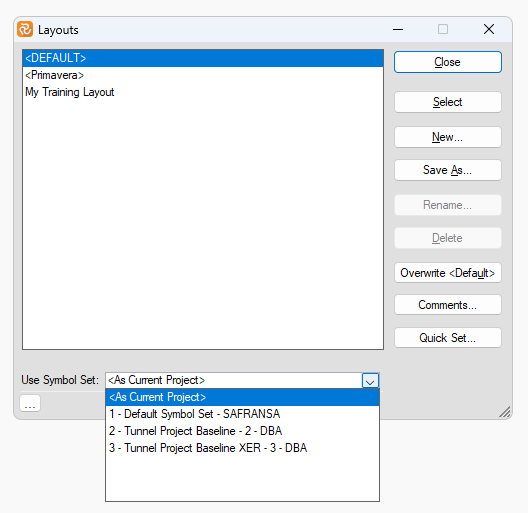
If you have particular personal needs for symbols and are not allowed to (or wish to) add them to the Project's symbol set, then you may create your own symbol set and ensure that your layouts read for that symbol set:
Symbol sets may also be exported/imported to a database.
You may also be interested in reading about how to set up a Symbol set.
Changing Single Bar Properties
Safran Planner allows you to edit properties for a single activity bar. Highlight the bar in the Gantt area and press the right mouse button. Now select the properties option to edit the bar properties for the chosen activity. Safran lets you change any of the attributes for this single bar.
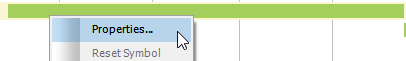
Change attributes as desired to highlight this single activity and press OK.
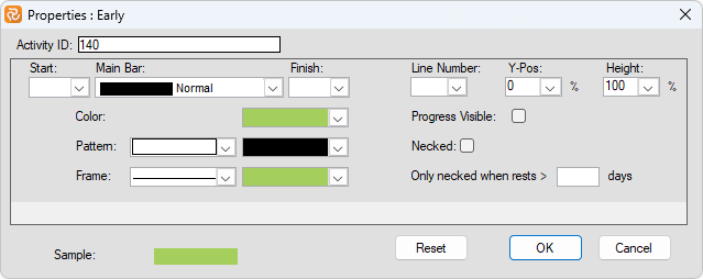
Now, Safran redraws the bar for this activity using these attributes. Attributes may be reset by selecting the Reset option.
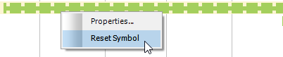
Within the Symbol set, by clicking on the relevant symbol, the 'Exceptions...' box becomes active when one or several bars have been edited as described above.