The Barchart Editor Histogram
In addition to the Grid and the Gantt chart, the Barchart Editor has six panes: Activity information, Link Information, Resources, Histogram, Risk, and Logic Navigator.
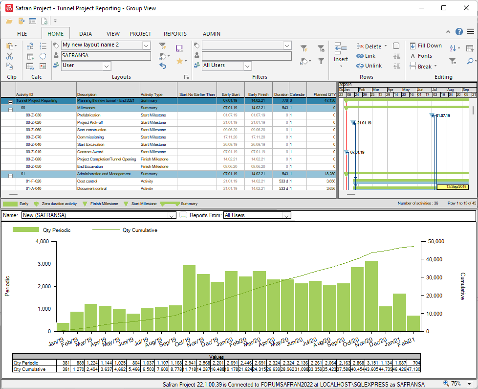
The Histogram pane provides feature-rich functions that allow you to view periodic and cumulative data presented as bars and lines together with table data. At the same time, you add, edit, modify, or browse through your project activities.
The Histogram pane not only serves as a barchart sub-view but also as a reporting tool due to its rich formatting capabilities. In addition to presenting scope, cost, and qty data, the Editor Histogram report may give periodic or cumulative summarized and aggregated information in userfields.
The information presented can be grouped, stacked, and spread. You can apply filters across the Barchart and the Histogram, or you can create a filter to be applied to the Histogram view only, and you can create summarized reports or set a “page by” definition to produce a report that spans several pages summarized by the selected field.
The layout and data content features are numerous. You may add horizontal and vertical lines and curtains to highlight important information. You can print the reports directly from the view or examine the graph in a full-size preview before printing. If you create report specifications from this view, they can be included in your report groups and packages. Reports can be saved to SWA, or report specifications may be run from the SWA client.
Specifications can be exported and imported to share them between different Safran Project databases. You can also import Histogram reports contained in Safran Planner files.
Note that Safran Project provides two types of histogram and S-curve reports. This chapter explains the Histogram pane report in the Barchart Editor. For details about the other Histogram report, see the chapter on Reports and Graphics. Both Histograms provide much of the same features you would expect from a histogram. The BE Histogram is slightly more customizable than the other, so most users prefer to start with the Histogram S Curve report if you are a beginner.
How to create a new histogram
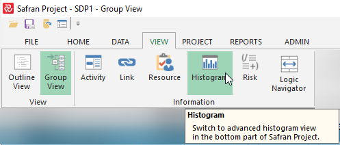
- Click View - Histogram or right-click on the legend bar and then click Histogram.
- Drag the grey horizontal line under the legend area to adjust the size of the histogram view.
- Right-click in the histogram view and then click on histogram properties.
- Click the Save As or New button in the top right corner and enter a name in the dialog box.
To modify your report, see Histogram Properties.
Histogram Properties
To specify the appearance of the line graph, profiles, and histogram, use the Histogram Properties window. The Histogram Properties window is a tab-separated window that allows you to specify appearance, content, and data fields. You can also save your formatting with a report name for later re-use. We will now look at the different sections of the Histogram Properties window, starting with the Report section.
Top
The histogram properties can be saved for later use by adding and saving a report name.

| Fields and buttons | Description |
|---|---|
| Name | Select a report from the drop-down list. |
| Reports From | Reduces or increases the number of reports in the drop-down list. |
| New | Create a new histogram report (enter a name in the New Report dialog box). |
| Save As | Save the selected histogram report with a new name (enter a name in the Save Report As dialog box). |
| Rename | Rename the selected histogram report. |
| Delete | Delete the selected histogram report (click the OK button in the Delete Report dialog box to confirm). |
Bottom

| Fields and buttons | Description |
|---|---|
| Comments... | Allows the report owner to add a longer descriptive text to the report. |
| Preview | Allows you to preview modifications before saving the report. |
| Apply | Apply changes has the same effect as OK, only that the Properties window remains open. |
| OK | Saves all changes and closes the properties window. |
| Cancel | Changes performed in the properties since last saved (Apply/OK) are undone - Properties window closes. |
The comment will also be available in the Report Package 'Order' tab:

The next two topics will look at the following tabbed sections.
Histogram Setup

Histogram Entries

Histogram Setup
The content of these tabs are described in this section.
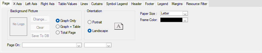
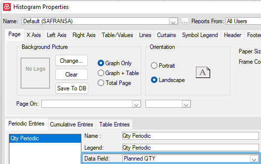
Page
The Page tab lets you select a background picture to be overlaid by the graph, and it allows you to specify page orientation. Using the 'Page on' options, you can produce multi-page reports divided by codes in a reference field or levels in an Outline Code.
Please note that if you have entered Resource availability for Reference or Outline codes, these can be added as entries for the graph and presented as profiles, line graphs, or bars on the page.
To view a Barchart Editor Histogram with multiple pages, you can either present the graph in the Print Preview window and view this page-by-page or scroll through the Histogram view.
X Axis
The X-axis interval applies to curves, histograms, and table data intervals. The user can set the period, which does not have to be identical to the Gantt period.
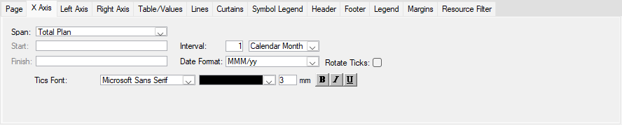
| Fields and buttons | Description |
|---|---|
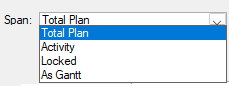
| Span | The histogram can be displayed over the Total plan, for the Activity (current activity), Locked (for a period of time), or the same time span selected in the Gantt Timeline. |
| Start | Is available when Span is locked. Enter a start date in this field. |
| Finish | Is available when Span is locked. Enter a Finish date in this field. |
| Interval | Select the interval and the period (year, quarter, project month, month, week, day) from the drop-down list. |
| Date Format | Select the date format from the drop-down list. |
| Rotate Ticks | Tick this checkbox if you want the date/text to be rotated 90 degrees to the left. |
| Tics Font | Select font type, Color, size, bold, italics, and underline. |
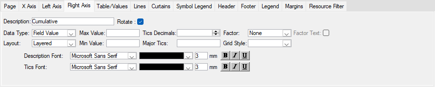
Left/Right Axis
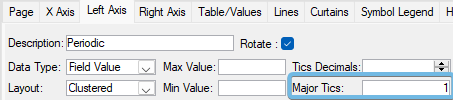
The left and right Y-Axes are formatted individually. The left axis represents the periodic values, while the right axis represents the cumulative lines (S-curves). You can specify axis description, select font and Color, tics, max value, number of decimals displayed, and factor for large numbers (millions, thousands, none). The periodic axis and data can be shown as quantities/numbers or manpower. The cumulative (right axis) can show numbers/quantities or percentages.
Left Axis (Periodic values):
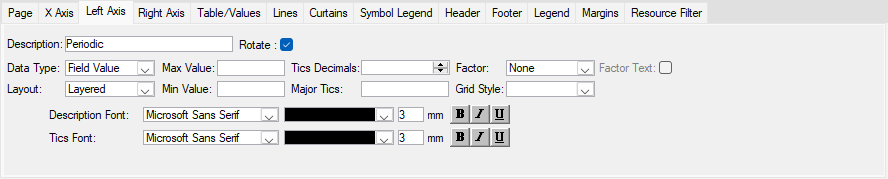
Right Axis (Cumulative values:
| Fields and buttons | Description |
|---|---|
| Description | Text field, text displayed in the left/right axis. |
| Data Type | Left axis: Select between Field Value and Manpower. Right axis: Select between field value and Percentage. |
| Max Value | Enter the maximum value for the axis scale. |
| Tics Decimals | Enter or select the number of decimals you want to show from the spinner box. |
| Factor | Select None, Thousands, or Millions from the drop-down list. |
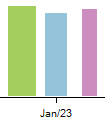
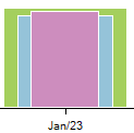
| Layout | Select between layered or clustered. |
| Min Value | Enter the minimum value for the axis scale. |
| Major Tics | Enter the steps of the tics. |
| Grid Style | Select grid style from the drop-down list. |
| Factor Text | Available when selected Factor is other than None. When ticked, the selected Factor will be displayed on top of the left/right axis (scale). |
| Description font | Select a font type, Color, size, bold, italics, and underlined for the description. |
| Tics font | Select a font type, Color, size, bold, italics, underlined for the tics. |
Clustered looks like this
(The thickness of the bars is controlled by 'Separation' in the Periodic Entries tab)
Layered looks like this
Major Tics
100 vs 1000
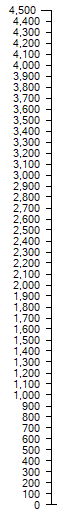
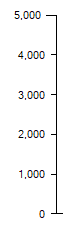
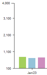
Max Value/Min Value/Major Tics
This example:
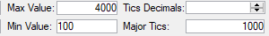
would look like this:
If Clustered
If Layered
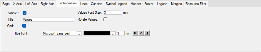
Table/Values tab
The Table/Values tab allows you to specify the data appearance in the table. The formatting options include title font, font size and Colour, grid and more. If you remove the default visible check mark, your report will be displayed without the table.
| Fields and buttons | Description |
|---|---|
| Visible | Tick this checkbox to display a table under the histogram. |
| Values Font Size | Font size for the content of the table. |
| Title | Header title for the table. |
| Rotate Values | Tick this checkbox to rotate the values 90 degrees to the left. |
| Grid | Tick this checkbox for the grid in the table. |
| Title Font | Select font type, color, size, bold, italics, and underlined for the title. |
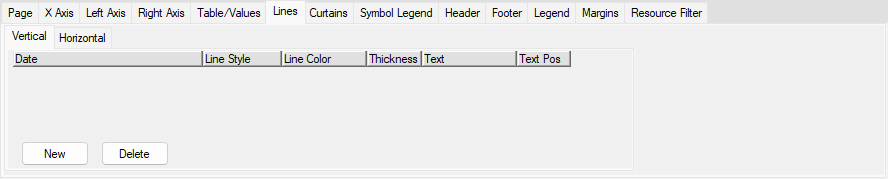
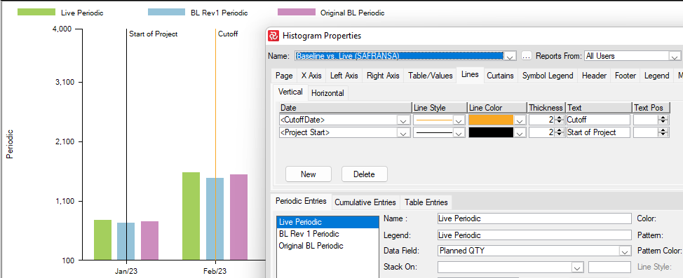
Lines tab
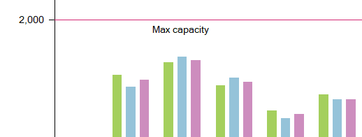
You use the Lines tab to add vertical or horizontal lines across the graph area. In the Vertical tab, you specify a Date, Line Style, Line Colour, Line Thickness, Text and Text Position. You can add as many lines as needed.
Vertical:
Horizontal:
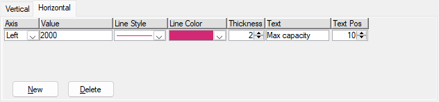
| Fields and buttons | Description |
|---|---|
| Date | Enter a date where you want to position the vertical line. |
| Text | Text displayed together with the vertical line. |
| Text Pos | Text Pos is a spinner box where you can select from 0 to 100 using the arrows (intervals of 5). You can also enter the value using the keyboard. The number is a percentage of the height of the Gantt area (0% = at the top of the Gantt area and 100% = at the bottom). |
| Line Style | Select a line style from the drop-down list. |
| Line Color | Select a Color from the drop-down list. |
| Thickness | Select or enter line thickness. |
| Axis | Choose if the Value will be assigned to the values on the Left Axis or the values on the Right Axis. |
| Value | Enter the value you want the line to be positioned at. |
| New | Adds a new line to the list. |
| Delete | Deletes the selected line from the list. |
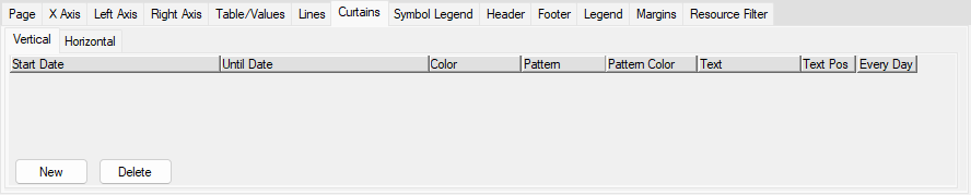
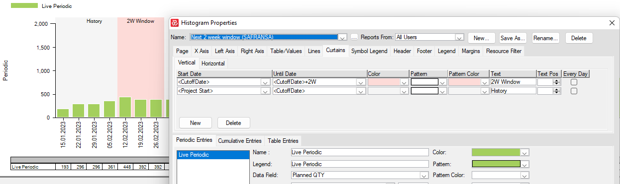
Curtains tab
Use the Curtains - Vertical tab to define background shading to highlight specific periods ( for example, a shutdown period, a test and commissioning period, holidays, weather windows, lifting campaigns, tow out, and more).
Vertical:
Horizontal:
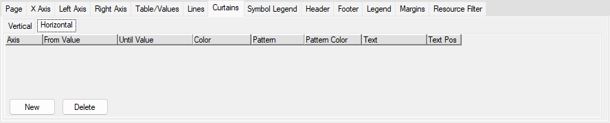
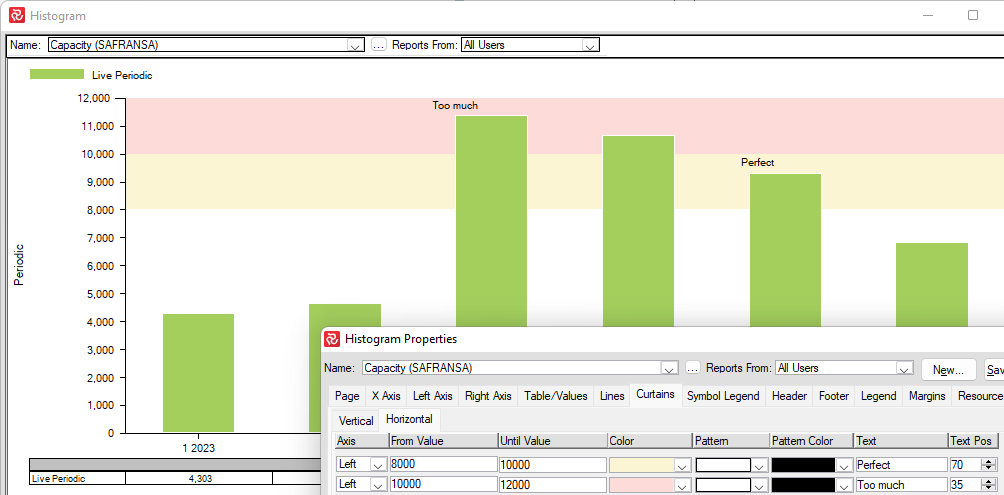
| Fields and buttons | Description |
|---|---|
| Start Date | Enter a Start Date or select a date from the global dates Date/Time, Timenow, CutoffDate or Project Start in the drop-down list. |
| Until Date | Enter a Date or select a date from the global dates Date/Time, Timenow, CutoffDate or Project Start in the drop-down list. |
| Color | The curtain Color can be selected here. |
| Hatch | Hatch style can be selected here. |
| Hatch Color | Hatch Color can be selected here. |
| Text | If you want text together with the curtain, enter the text here. |
| Text Pos | Text Pos is a spinner box where you can choose from 0 to 100 using the arrows (intervals of 5). You can also enter the value by the keyboard. The number is a percentage of the height of the Gantt area (0% = at the top of the Gantt area and 100% = at the bottom). |
| Axis | Choose if the Values will be assigned to the values on the Left Axis or the values on the Right Axis. |
| From Value | Enter the From Value. |
| Until Value | Enter the Until Value. |
| New | Adds a new curtain to the list. |
| Delete | Deletes the selected curtain from the list. |
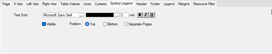
Symbol Legend
The symbol legends tab allows you to specify text font, font color, font style, and size for the symbol legend display. The appearance of the report is controlled by the page setup.
| Fields and buttons | Description |
|---|---|
| Text Font | Select font type, color, size, bold, italics, and underlined for the Symbol legend. |
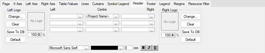
Header
A Header is used to display additional information in your report. You can include information as company name, schedule title etc.
| Functionality | Description |
|---|---|
| Left Logo – Slider | Select scaling for the logo. |
| Left Logo – Change | Click the Change button to add a picture as a logo. |
| Left Logo – Clear | Removes the logo. |
| Titles – Left | Three lines of text where you can enter text or select values from the drop-down list. |
| Titles - Centre | Three lines of text where you can enter text or select values from the drop-down list. |
| Titles – Right | Three lines of text where you can enter text or select values from the drop-down list. |
| Font/Color/Size/Bold/Italics/Underline | Each of the Title lines can be formatted with font, color, size, bold, italics, and underlined (ensure you are in the correct field when you apply formatting). |
| Right Logo – Slider | Select scaling for the logo (bmp only). |
| Right Logo – Change | Click the Change button to add a picture (bmp) as a logo. |
| Right Logo – Clear | Removes the logo. |
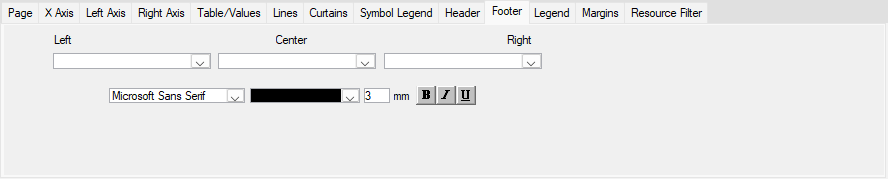
Footer
The footer is used to display additional information about the schedule.
| Functionality | Description |
|---|---|
| Left | Select a field and enter text from this combo box (if you combine field and text, select the field first and then enter the text). |
| Centre | Select a field and enter text from this combo box (if you combine field and text, select the field first and then enter the text). |
| Right | Select a field and enter text from this combo box (if you combine field and text, select the field first and then enter the text). |
| Font/Color/Size/Bold/Italics/Underlined | Format the text for the fields above. |
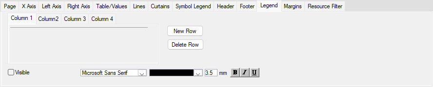
Legend
The Legend appears at the bottom of the page, above the footer. It is possible to include 19 rows of legend information and four columns of legend Items.
| Functionality | Description |
|---|---|
| Legend Items – Columns 1-4 | In the Legend area, you can add different types of information in 4 columns and several numbers of lines for each of the columns. Each line with information consists of two fields. The first is similar to a label, and the other is for the information. This information can be either text or values from the drop-down list. |
| Visible | Tick this checkbox to display the Legend items in the report. |
| New Row | Adds a new row in the selected column. |
| Delete Row | Deletes the selected row in the selected column. |
| Font/Color/Font size/Bold/Italics/Underlined | Apply text formatting for the selected row. |
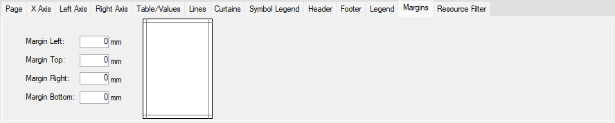
Margins
Specify each margin individually. Changing margins settings align the report on your paper.
| Functionality | Description |
|---|---|
| Margin Left | Enter the margin size. |
| Margin Top | Enter the margin size. |
| Margin Right | Enter the margin size. |
| Margin Bottom | Enter the margin size. |
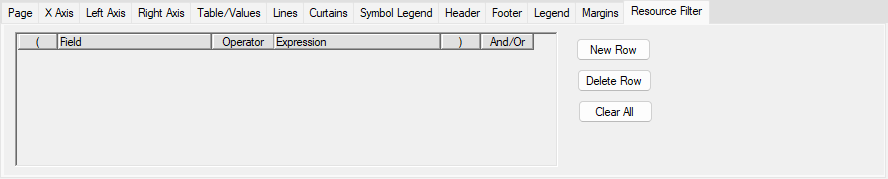
Resources
In the Resource tab, you may filter out which resources to report using a window familiarized with the filter window.
| Fields and buttons | Description |
|---|---|
| Parenthesis, Field, operator, expression, parenthesis, and/or | Input the criteria for the Filter to select the activities you want Assign Fields to affect. |
| New Row | Inserts a row above an existing row. |
| Delete Row | Deletes the selected row. |
| Clear All | Remove all rows in the Formula area. |
Histogram Entries
- Periodic Entries - Defines which bars to be displayed in the histogram report
- Cumulative Entries - Defines which s-curves to be displayed in the report
- Table Entries - Defines which table data to be displayed in the report (periodic, cumulative, totals or stacked values)
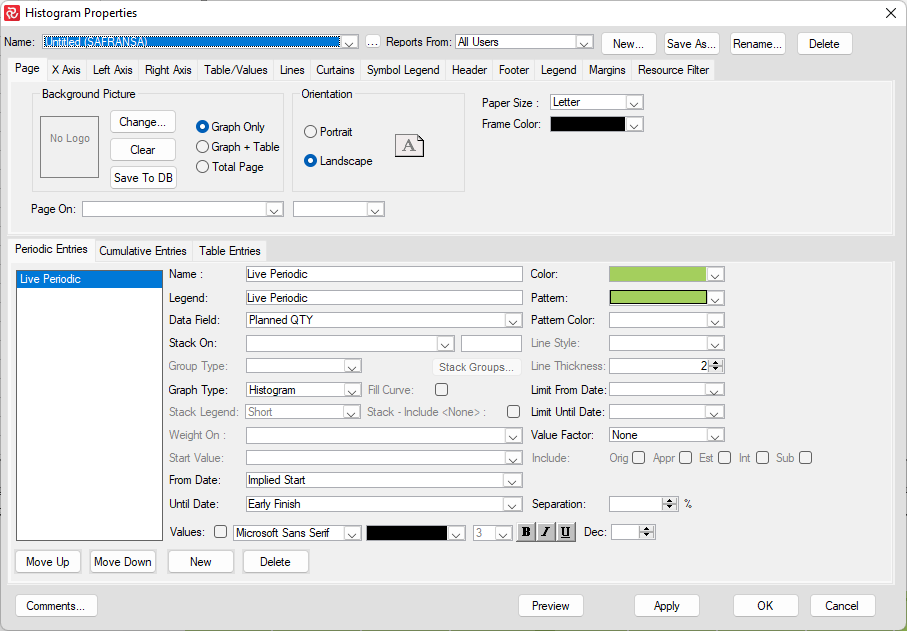
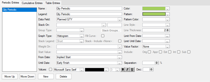
Periodic Entries tab
Histograms and profiles show periodic quantities per period. Select a profile to display a continuous profile line across the time scale. Select Histogram to display separate columns for each period. Columns may be stacked, layered, or clustered and separated by specifying a percentage for separation. You can define several entries to be included on your chart.
Specify a legend (description) for the entry, and specify the data field from quantity fields or user-defined data (integer and decimal type fields). Outline codes, reference fields, and user-defined text and flag fields can stack data. If you stack your data, you can click the Stack Groups button to select Color and shading for each element.
| Fields and buttons | Description |
|---|---|
| Name | Enter a text to name the periodic entry. |
| Legend | Enter a text to describe the periodic entry. |
| Data Field | Select data field from the drop-down list. |
| Stacked By | Select the data field to stack by. |
| Weight On | It is only available if you, on the right axis tab specify field value to be percent. Using the 'weight on,' you can specify what field holds the value that should be used as the 100% - if it is other than the selected data field. Your data field will then be weighed against this field to determine the periodic percentage for each period. |
| From Date | Select the start date from the drop-down list. |
| Until Date | Select the finish date from the drop-down list. |
| Graph Type | Select Histogram, Line Graph, or Profile from the drop-down list. |
| Separation | Only available if the selected Graph type is Histogram. This can be used if you want to have some space between the columns in the histogram, given in %. |
| Stacking – Include None | The checkbox is available when the histogram is displayed as stacked. When the checkbox is ticked, the activities that do not have values in the field used for stacking will be shown as a single group called None. |
| Stack Groups… | This will open the Stack Groups window for changing Color and hatching. |
| Values – Font – Dec | Ticked checkbox will give the total value on top of each column. Select a font type, size, color, bold, italics, and underlined for the value displayed. In the Dec spinner box, you can select how many numbers after the decimal point you want to display. |
| Color | Select the color for the graph from the drop-down list. This only applies if Stacked By is not used (if Stacked By is used,) then change the color in Stack Groups…). |
| Pattern | Select the pattern type for the histogram from the drop-down list. Available when the selected Graph type is Histogram and Stacked By is not used. |
| Pattern Color | Select the pattern color for the histogram from the drop-down list. Open when the graph type chosen is a histogram and Stacked By is not used. |
| Line Style | Available when the Graph type is Line Graph or Profile Select style from the drop-down list. |
| Line Thickness | Available when the Graph type is Line Graph or Profile, Enter, or select thickness from the spinner. |
| Limit From Date | It can show the Histogram/Profile/Line Graph for a certain period. Add or select a date from the drop-down list for the period. |
| Limit Until Date | Add or choose a date from the drop-down list for the period. |
| Value Factor | Select None, Thousands, or Millions from the drop-down list. |
| Stack Legend | Legend will show either Short Description or Short + Description for stacked values. |
| Move Up/Move Down | Select an item in the Periodic entries list and move it up or down in the list using these two buttons. |
| New | Adds a new row in the Periodic entries list. |
| Delete | Deletes a row in the Periodic entries list. |
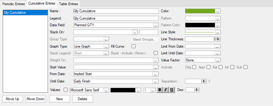
Cumulative Entries tab
Cumulative lines or curves show accumulated use for cost, budget, earned value, or other user-defined data. Select the Cumulative Entries tab; then, you can give the entries your description and legend, select the data field, select from and until date fields to spread or summarize data across and specify graph type as a Line graph.
| Fields and buttons | Description |
|---|---|
| Name | Enter a text to name the cumulative entry. |
| Legend | Enter a text to describe the cumulative entry. |
| Data Field | Select data field from the drop-down list. |
| Spread On | If you select a field or a level of an outline code, Safran Planner will use this to perform multiple time-- aggregations to provide you with numerous s-curves on a single report sheet against one X-axis. This is a unique feature. You may use it to show curves for different project phases side by side. This can be valuable for evaluating and visualizing how your project phases fit. Spread curves can be displayed for field value or percentage. |
| Weight On | It is only available if you, on the right axis tab, specify the field value to be percent. Using the 'weight on,' you can specify what field holds the value that should be used as the 100% - if other than the selected data field. Your data field will then be weighed against this field to determine the cumulative percentage for each period. |
| From Date | Select the start date from the drop-down list. |
| Until Date | Select the finish date from the drop-down list. |
| Graph Type | Select Histogram, Line Graph, or Profile from the drop-down list. |
| Separation | Available if the selected Graph type is Histogram. This can be used if you want to have some space between the columns in the histogram, given in %. |
| Values – Font - Dec | Ticked checkbox will provide the total value on top of each column. Select a font type, size, color, bold, italics, and underlined for the value displayed. Choose if the number should be shown as a decimal value. |
| Color | Select the color for the graph from the drop-down list. |
| Pattern | Select the hatch type for the histogram from the drop-down list. Available when the selected Graph type is Histogram. |
| Pattern Color | Select pattern Color for the histogram from the drop-down list. Open when the selected Graph type is histogram. |
| Line Style | Available when the Graph type is Line Graph or Profile Select style from the drop-down list. |
| Line Thickness | Available when the Graph type is Line Graph or Profile. Enter or select a thickness from the spinner. |
| Limit From Date | It can show the Histogram/Profile/Line Graph for a certain period. Add or select a date from the drop-down list for the period. |
| Limit Until Date | Add or choose a date from the drop-down list for the period. |
| Value Factor | Select None, Thousands, or Millions from the drop-down list. |
| Stack Legend | Legend will show either Short Description or Short + Description for stacked values. |
| Move Up/Move Down | Select an item in the list and move it up or down in the Table entries list using these two buttons. |
| New | Adds a new row in the Cumulative entries. |
| Delete | Deletes a row in the Cumulative entries. |
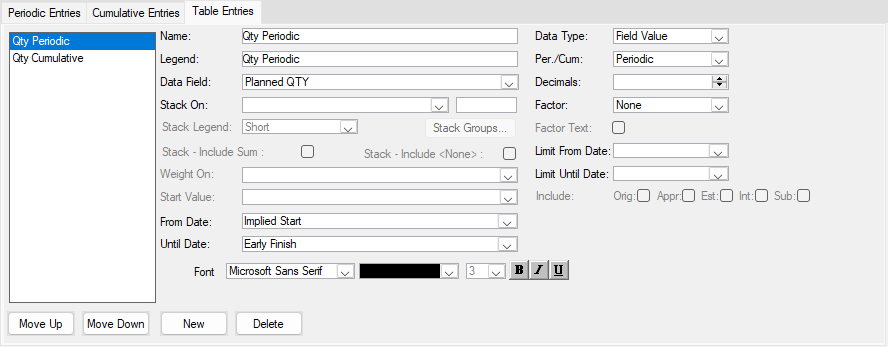
Table Entries tab
A new table entry is added by default for each periodic and cumulative entry you define. You can also include new user-defined table entries or delete entries from the table.
| Fields and buttons | Description |
|---|---|
| Name | Enter a test to name the table entry. |
| Legend | Enter a text to describe the table entry. |
| Data Field | Select data field from the drop-down list. |
| Spread On | If the Per./Cum = Cumulative: If the Cumulative Entries are spread, then the field used for spread on is visible here. In the table, there will be one row per code. If the Per./Cum = Periodic: If the Periodic Entries are stacked, then the field used for Stacked By is visible here. In the table, there will be one row per code. |
| Weight On | If the Cumulative Entries are weighed, the field used for 'weight on' is visible here. |
| From Date | Select the start date from the drop-down list. |
| Until Date | Select the finish date from the drop-down list. |
| Stacking – Include None | The checkbox is available when the histogram is displayed as stacked. When the checkbox is ticked, the activities that do not have values in the field used for stacking will be entered in the table as a group called None. |
| Values – Font - Dec | Select a hatch type for the histogram from the drop-down list. Available when the selected Graph type is Histogram. |
| Data Type | Select a data type from the drop-down list: Field Value, Manpower, or Percent. |
| Per./Cum | Select Periodic or Cumulative from the drop-down list. |
| Decimals | Select a number of decimals displayed in the table. |
| Factor | Select None, Thousands, or Millions from the drop-down list. |
| Factor Text | If the Factor is different from ‘None,’ you can tick the checkbox, and the factor will be displayed to the right table for each row. |
| Limit From Date | It can show the Histogram/Profile/Line Graph for a certain period. Add or select a date from the drop-down list for the period. |
| Limit Until Date | Add or choose a date from the drop-down list for the period. |
| Spread Legend | Legend will show either Short, Description, or Short + Description for stacked values. |
| Move Up/Move Down | Select an item in the list and move it up or down in the Table entries list using these two buttons. |
| New | Adds a new row in the Table entries list. |
| Delete | Deletes a row in the Table entries list. |
Count Activities Data field
The Data field 'Count Activities' counts the number of hits (activities/milestones/hammocks) based on the filter defined for your data field. You can define as many 'Count Activities' data fields as you wish. The field is only available for usage in the Barchart Editor Histogram/S-Curve report.
Examples of things to count:
- No of handovers
- No of completed, upcoming, or overdue milestones
- No of activities planned, early and late
- No of activities started, planned started, or to be started
- Logic; number of links – any hotspots?
- Document Schedule, no of IDC, IFC milestones
- Hits and Misses
How to create a 'Count Activities' data field?
When creating a new Histogram from scratch, the default data field is 'Planned Qty'.
Click on the arrow and choose 'Count Activities' from the drop-down list. Notice that a 'Filter box' appears. Click on 'Filter...' and enter your filter settings. You may use a previously stored filter or create a new one. The new filter does not need to be saved with a name. However, it is recommended to use the filter again elsewhere.
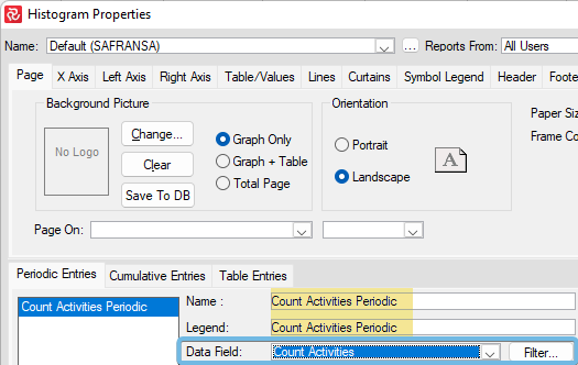
The 'Name' and 'Legend' texts can be modified, and if this is a report you plan to use later or communicate to others, we recommend renaming it to something more descriptive.
Example Histogram using 'Count Activities'
Below is an example of a histogram showing 'No of completed, upcoming, and overdue milestones' and its filter settings. The same filters are used on the milestone symbols in the Gantt.
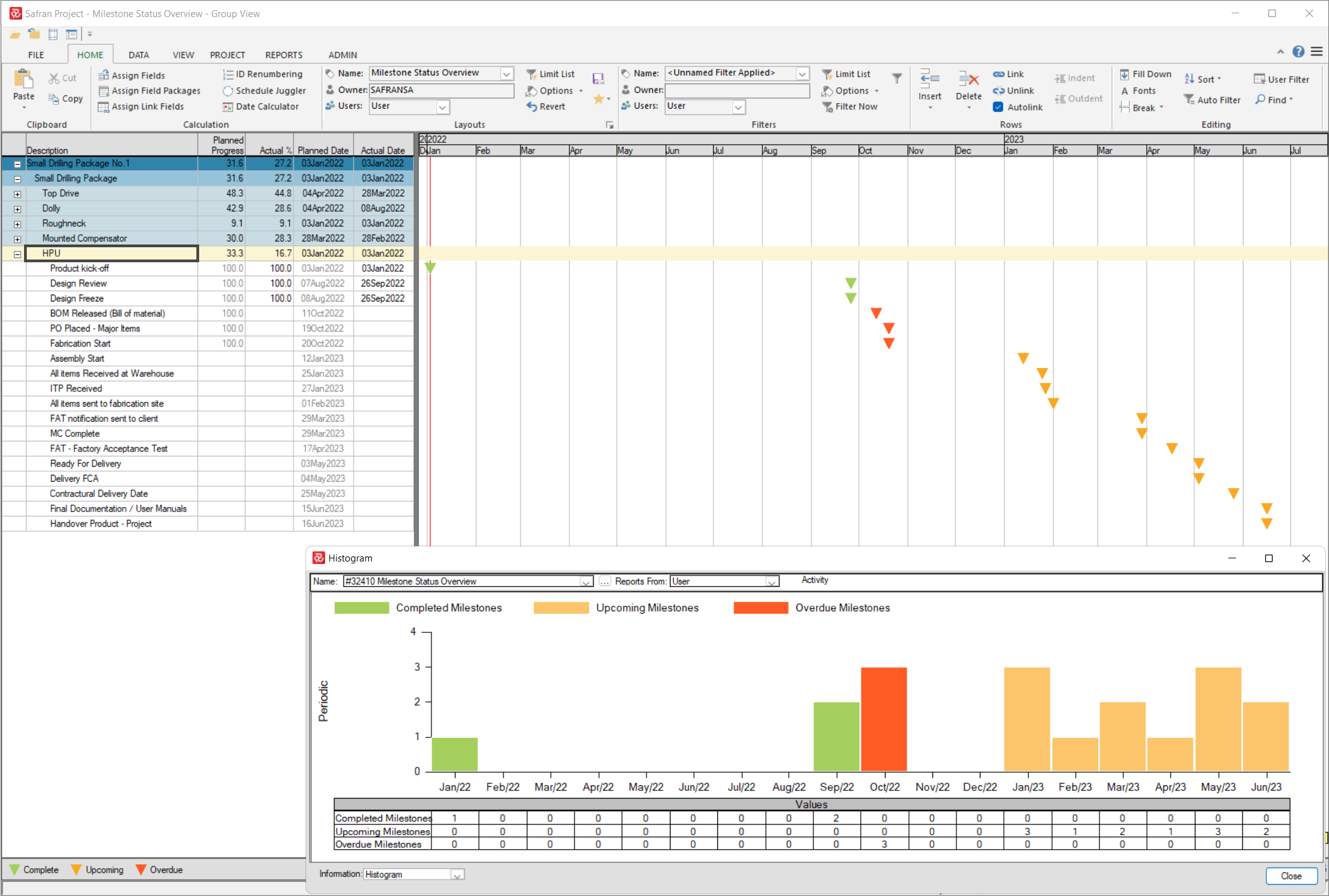
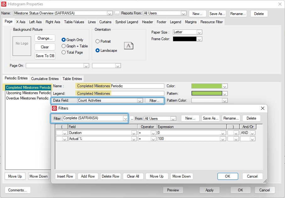
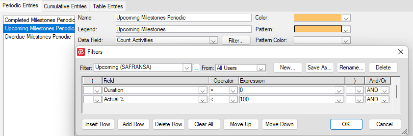
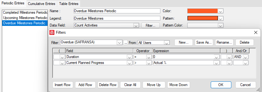
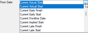
In this example, we have used the From date 'Current Actual Start' on completed milestones, while Upcoming and Overdue milestones use the 'Early Start' date. Which dates do you use? It depends on what you would like to reflect. Perhaps the 'Baseline Early Start' or 'Baseline Early finish' is more appropriate for what you want to communicate with your report.
Tip: Major tics should be set to minimum '1'