Distribution Comparison
Sensitivity analysis provides an automatic mechanism for calculating and assessing the impacts of individual risks on your project, Distribution Comparison allows you to perform similar analysis in a more flexible, controllable way.
As explained earlier in the ‘Distribution Graph’ section, whenever you run an analysis you have the option to send the current results for comparison by clicking the ‘Send to Comparison button’.
All of the results that are sent to distribution comparison will be saved until you remove them either by removing all using ‘Clear Graph’ or individually using ‘Delete Distribution’.
The results are saved independently of which project you have open. This means that you can not only perform comparisons of different scenarios within a project by selecting / deselecting groups of risks but you can also perform the same comparison across any projects within your organization.
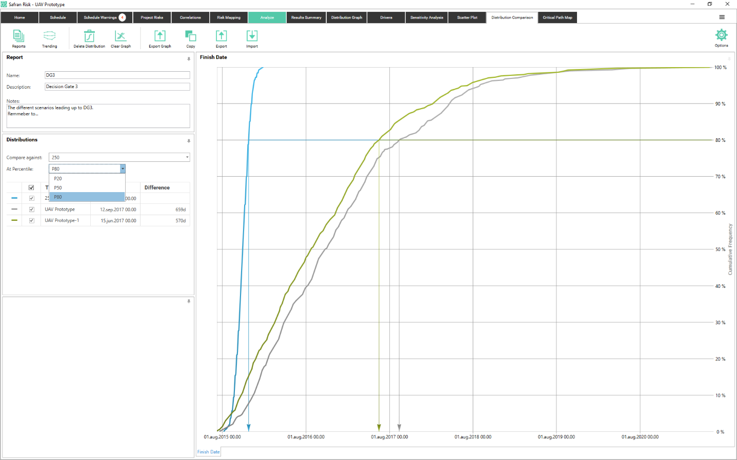
Each result can be given a meaningful title and all of the associated information such as the deterministic value, probability of completion, number of risks included etc. can all be viewed in the Details pane.
You can compare the distribution at any of your three selected focus percentiles. You switch between them by using the drop down above the grid. If you want to change the percentiles, you go to Focus Percentiles under Options.
Consistent with all the Safran Risk outputs you can either use the Export Graph button to save the results to a file or you can use the Copy button to save the results to the clipboard. You also have the possibility to export/Import the graphs in a XML file format which could be useful for comparing a number of different scenarios.
Reports
The distributions exported to Distribution Comparison are collected in a report. By clicking on the Reports button you can create new reports or switch to another report. When exporting the distribution from the Distribution Graph, it ends up in the currently open report.
The reports have a name, a description and a notes field.
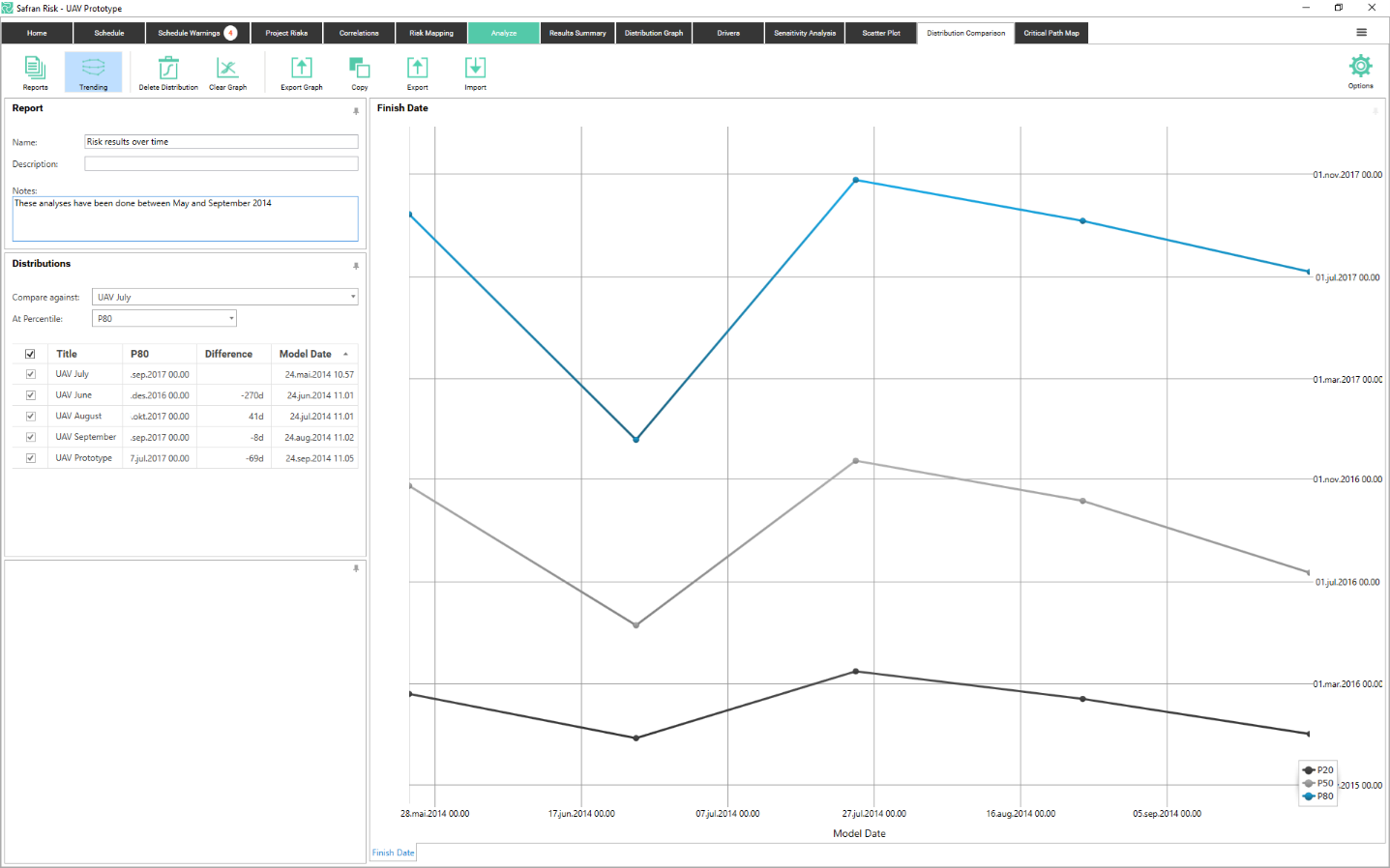
Trending
In order to see how the risk analysis results have changed over time, the distribution comparison report has a mode called “Trending”. In this mode the x axis shows when the analysis was done (the model date) and the y axis shows the result. For each analysis, the values of the focus percentiles are plotted. This results in a plot like the one below.
The model date is automatically set to the date you ran the analysis but can be changed in the table.
This graph can be very useful in describing whether the uncertainty in a project is increasing or decreasing.