Scatter Plot
In the Scatter Plot you can compare two distributions and see how they’re correlated to each other. You can also see the Joint Confidence Level (JCL) for a combination of two values. E.g.: What’s the probability of finishing before date x and below cost y? The plot visualizes each iteration as a dot, which position is determined by the two values that you choose.
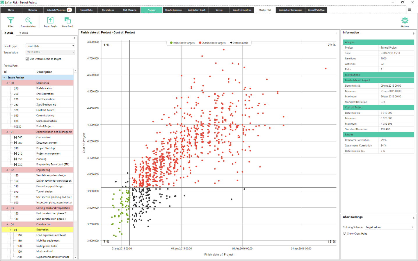
The picture above shows the default setup of the Scatter Plot. In it we’re comparing the project finish date (on the x axis) and the project cost (on the y axis). The plot tells us that there is only a 7% chance of finishing before the deterministic finish date and below the deterministic cost. This is visualized by the green markers in the lower left corner. The red markers in the top right corner shows that there is a 79% chance of being both late and over budget.
X and Y Axis
The two axes in the plot are controlled via the settings on the two tabs in the upper left part of the screen. Each axis in the plot has a Result type, Target Value and Project Part.
The Result Type can be Finish Date, Cost or Duration.
The Target Value can be set to the deterministic value or any custom value.
The project parts for the x and y axis are locked by default, meaning that you compare values for the same activity, summary or project.
If you’d like to compare, let’s say the duration of activity A with the cost of activity B you can do this by going to the “Y Axis” tab and unchecking “Same as X Axis”. Comparing different project parts can be useful in order to figure out if the correlation in your model is working as expected.
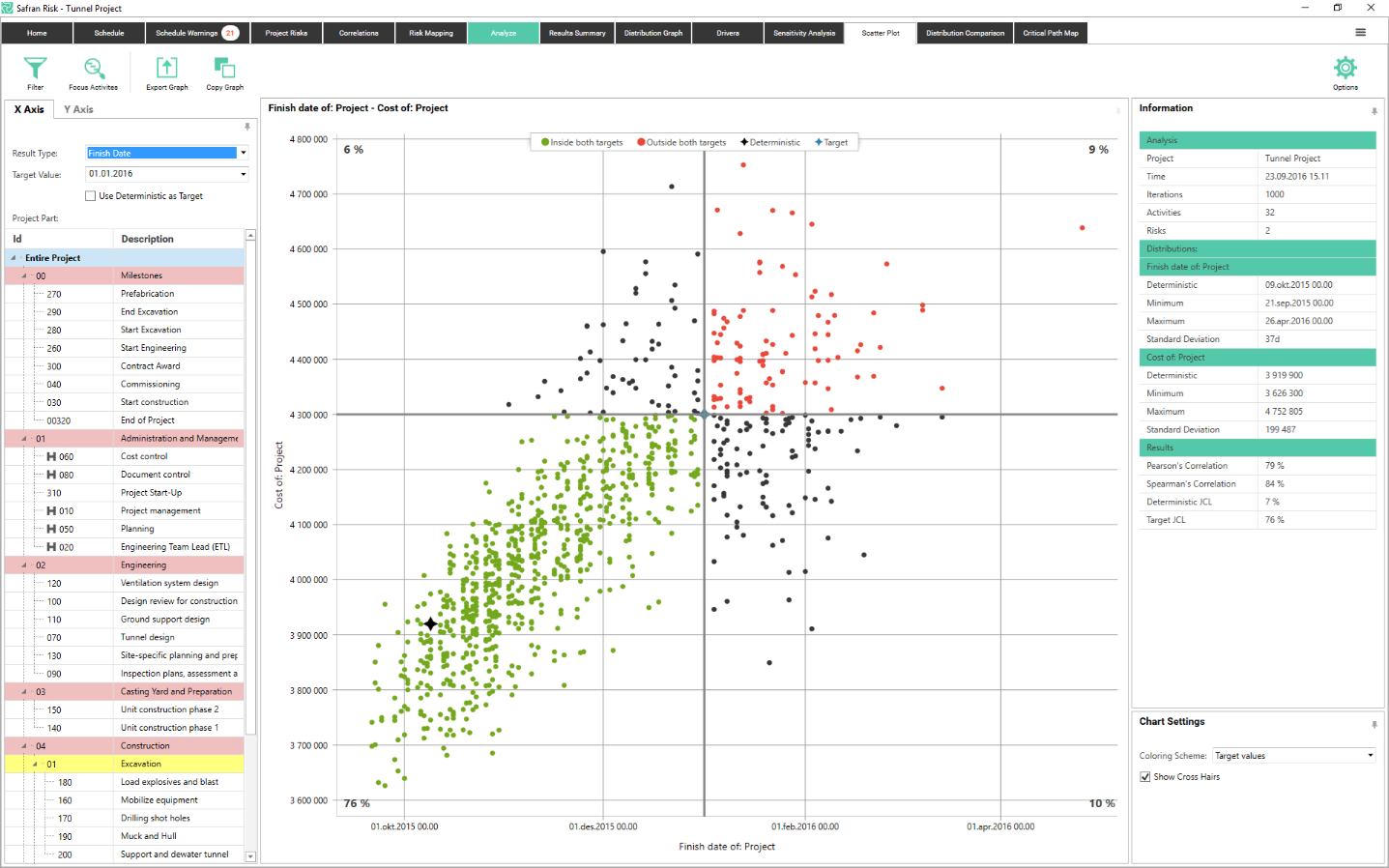
Target Values
If you’re interested in seeing the probability for some values other than the deterministic, you can uncheck “Use Deterministic as Target” In the example below the target value has been set to January 1 2016 for the x axis and 4 300 000 for the y-axis. The cross hairs are always centered to the target value. Note that you can still see the deterministic value as a black star.
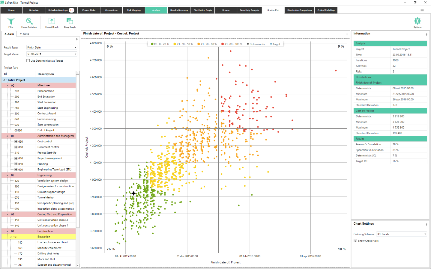
JCL Bands
By turning on the Joint Confidence Level (JCL) bands you can get a quick overview of how likely you are to end up in different section of the plot.
To turn them on you change the coloring scheme in the Chart Settings section in the bottom left corner. When JCL bands is selected the iteration dots are color codes depending on their JCL. The band limits are based on the focus percentiles that you can set the in the Options section.
In the example below we see that there’s a 20% chance of finishing in the green zone, a 50% chance of finishing in the yellow or green zone, an 80% chance to finish in the orange, yellow or green zone etc.
 {height="" width=""}